SOTTOSTUDIOS
EXPERIENTIAL SOLUTIONS
Brand Development Case Study
Miami College of Design- Industrial Art and Method

The IAM Story
It all started when we with two dynamic individuals who's personalities would reflect a new kind of experiential education.
Meet Walter Bender, ex-head of MIT Media Lab and Prof. Franco Lodato, noted Biodesigner, author and chief industrial designer from Motorola, Herman Miller, Gillette, and more.. They had selected Miami to found an institution to teach methodology of both industrial design and technology. What made this idea wholly unique is that in the future, user interface, such as wearables would be linked to technology and so they are personally transformative. Lodato and Bender wanted students to learn methods versus just technique, focused on the art of solving, and by doing. Each student would be transformed as a solver, and the identity wanted to convey that potential. Our assignment in naming the school was to first channel both Franco and Walter as to who they are and what is core to the program, and the vision of their founding partner, Antonio Malave. SottoStudios, via the passions of those individuals, informed the design of the architecture as well as the name, nomenclature and design of both the IAM foundation logo and it's counterpart, the Miami College of Design logo.
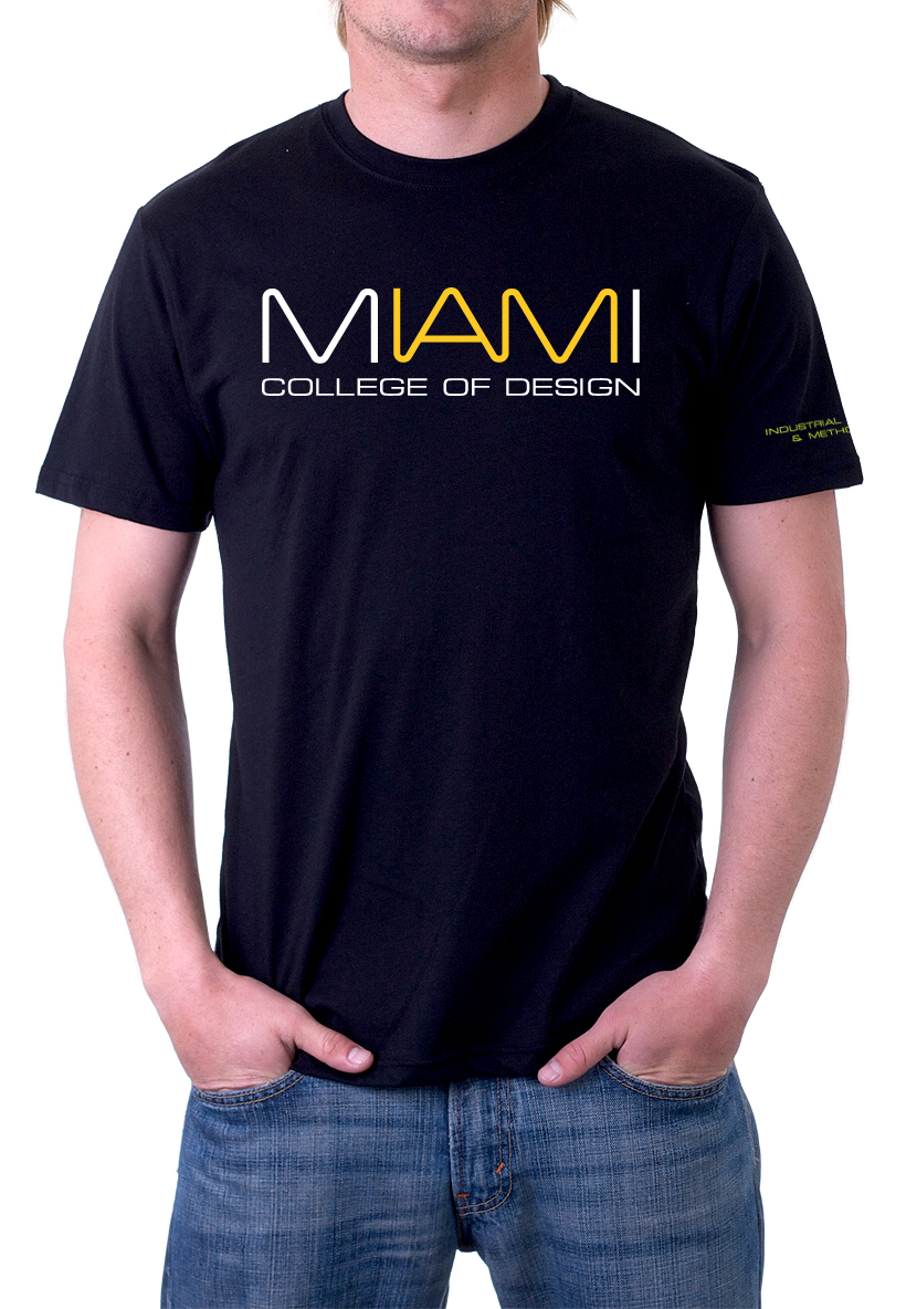
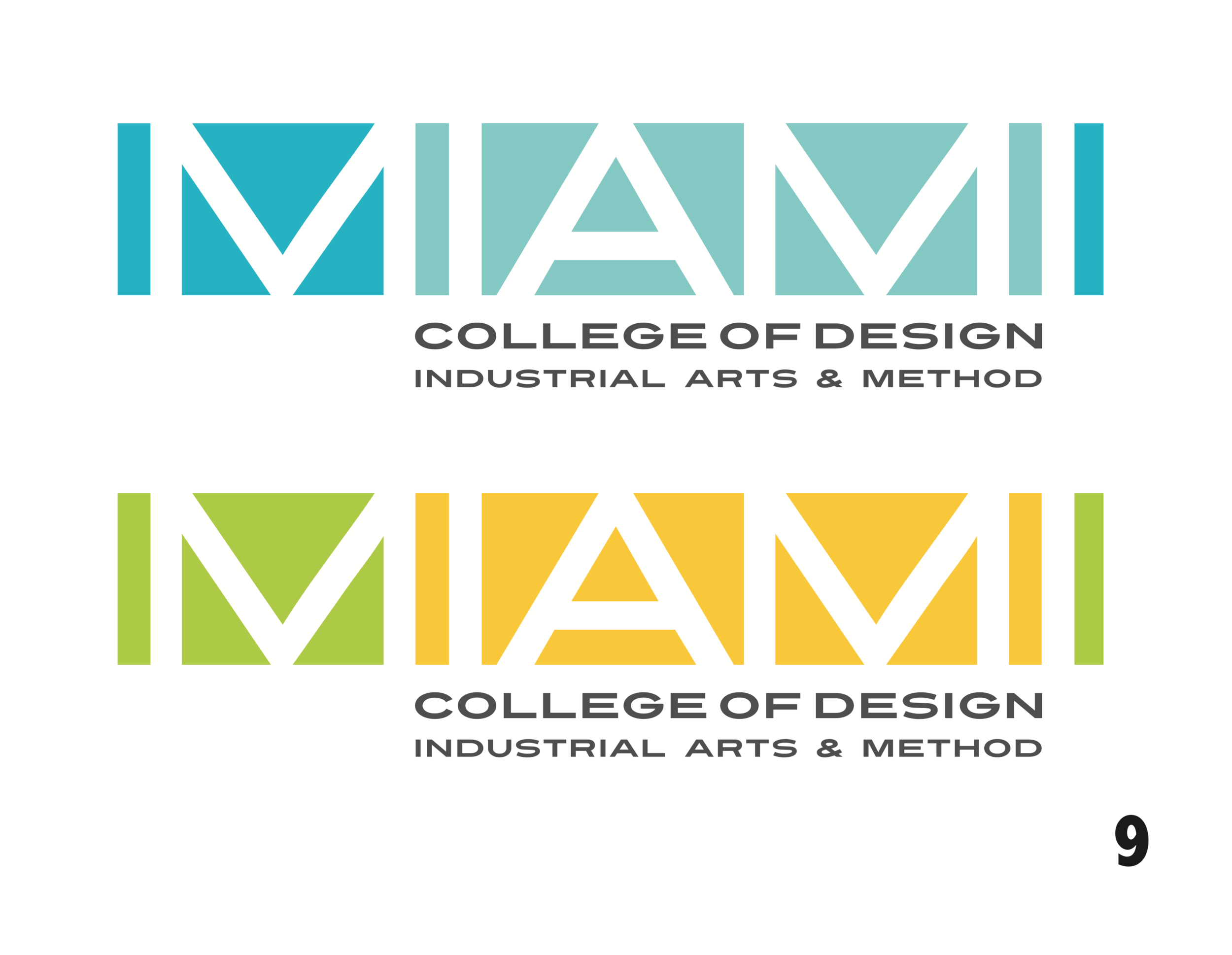
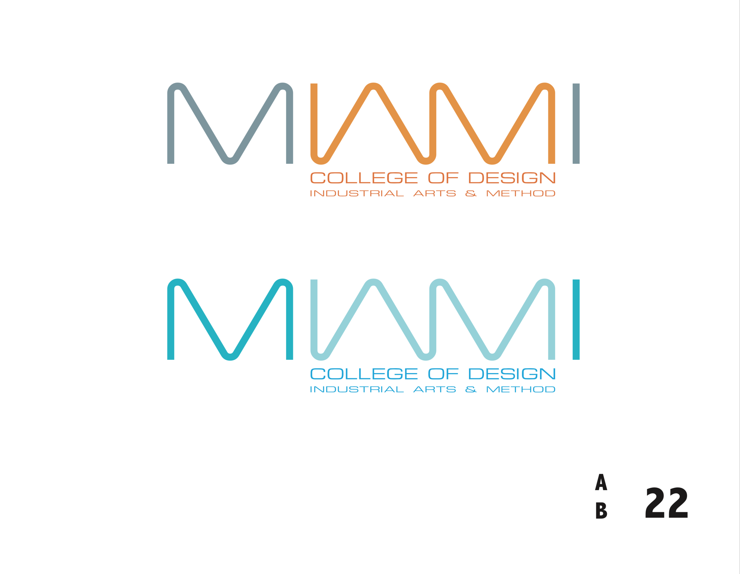
We often mock-up logos in familiar formats to help our client's visualize how it will appear in many potential contexts.

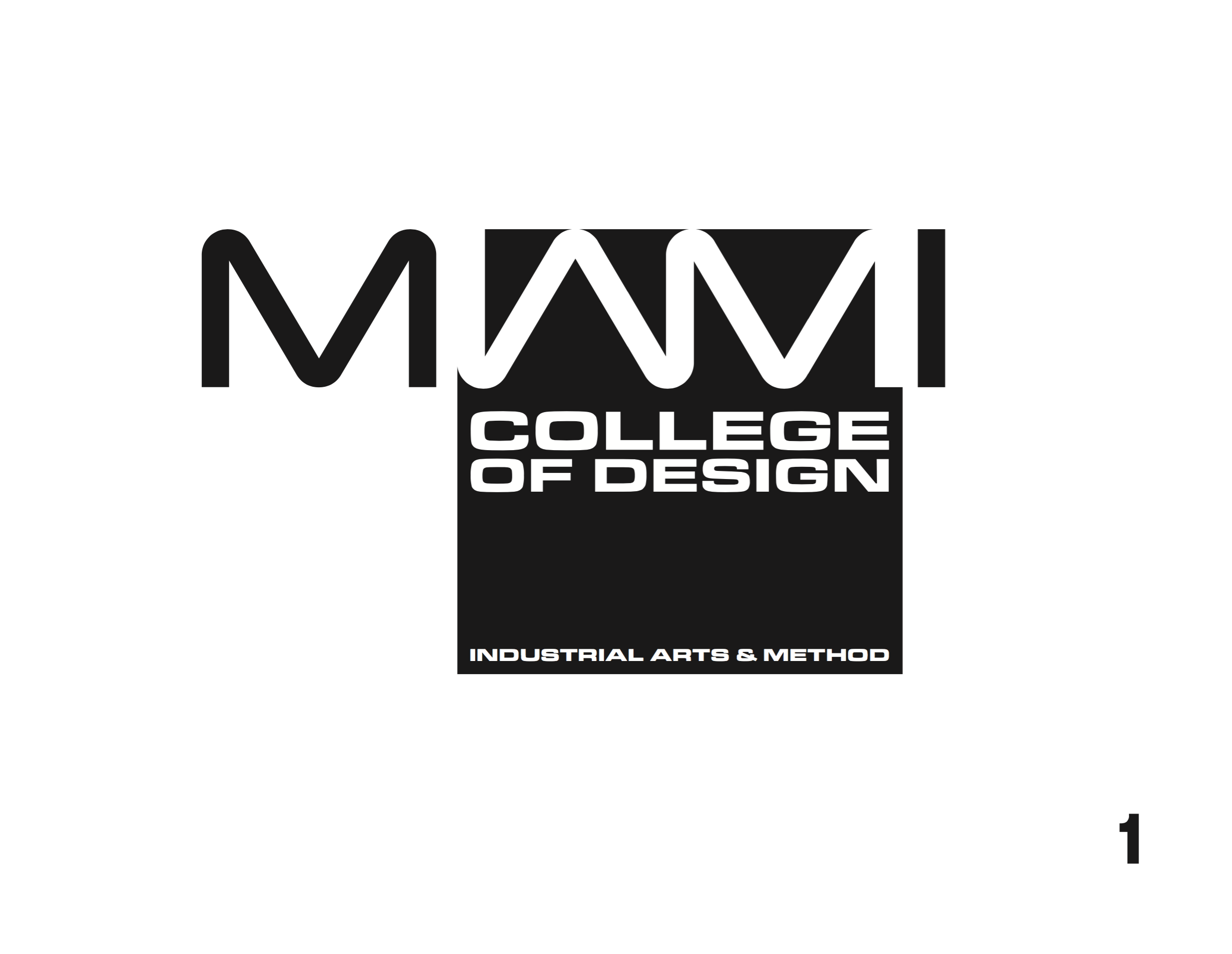
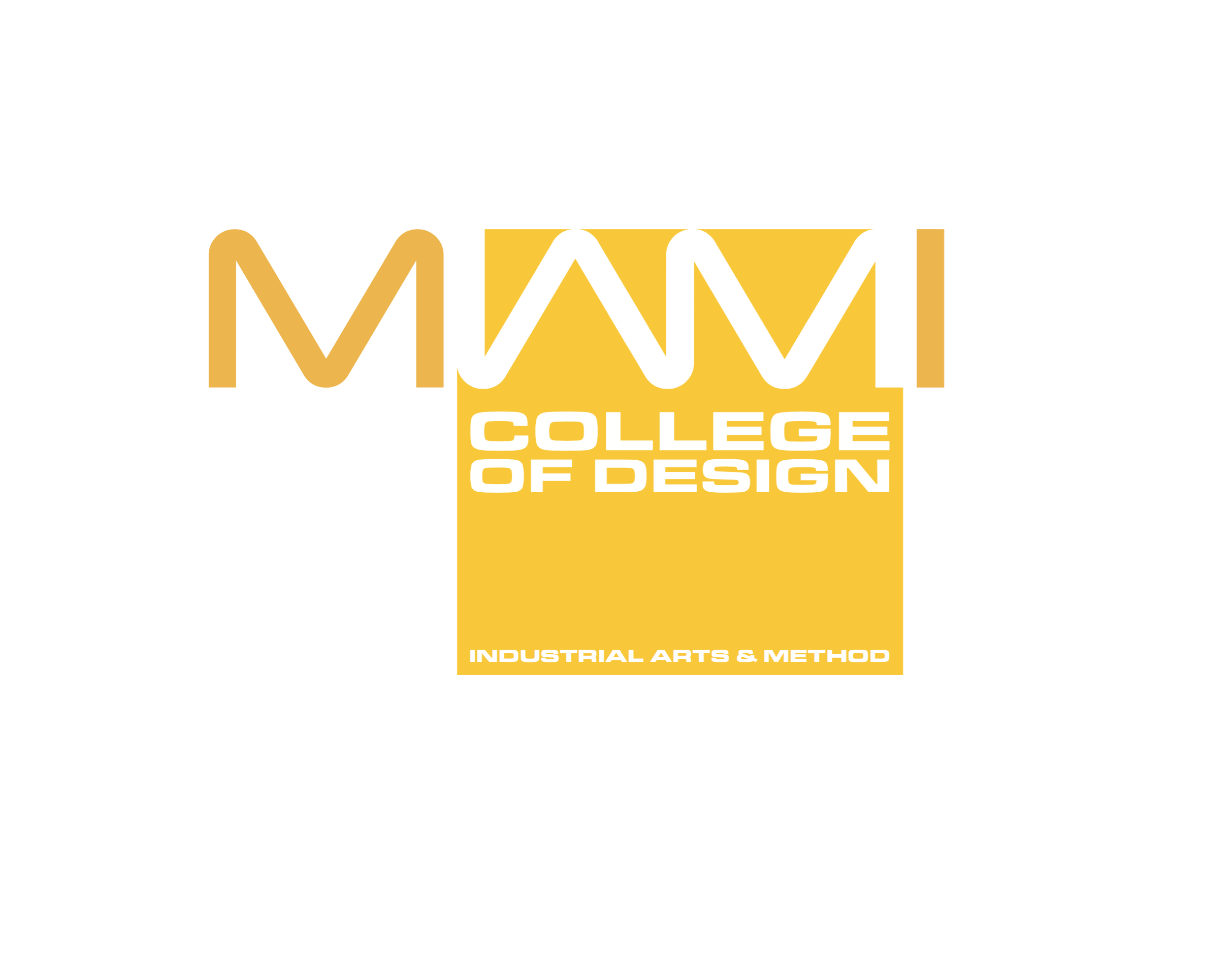
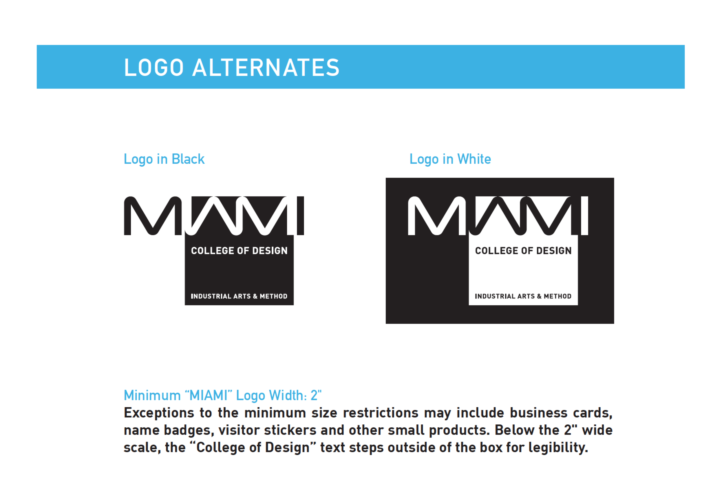
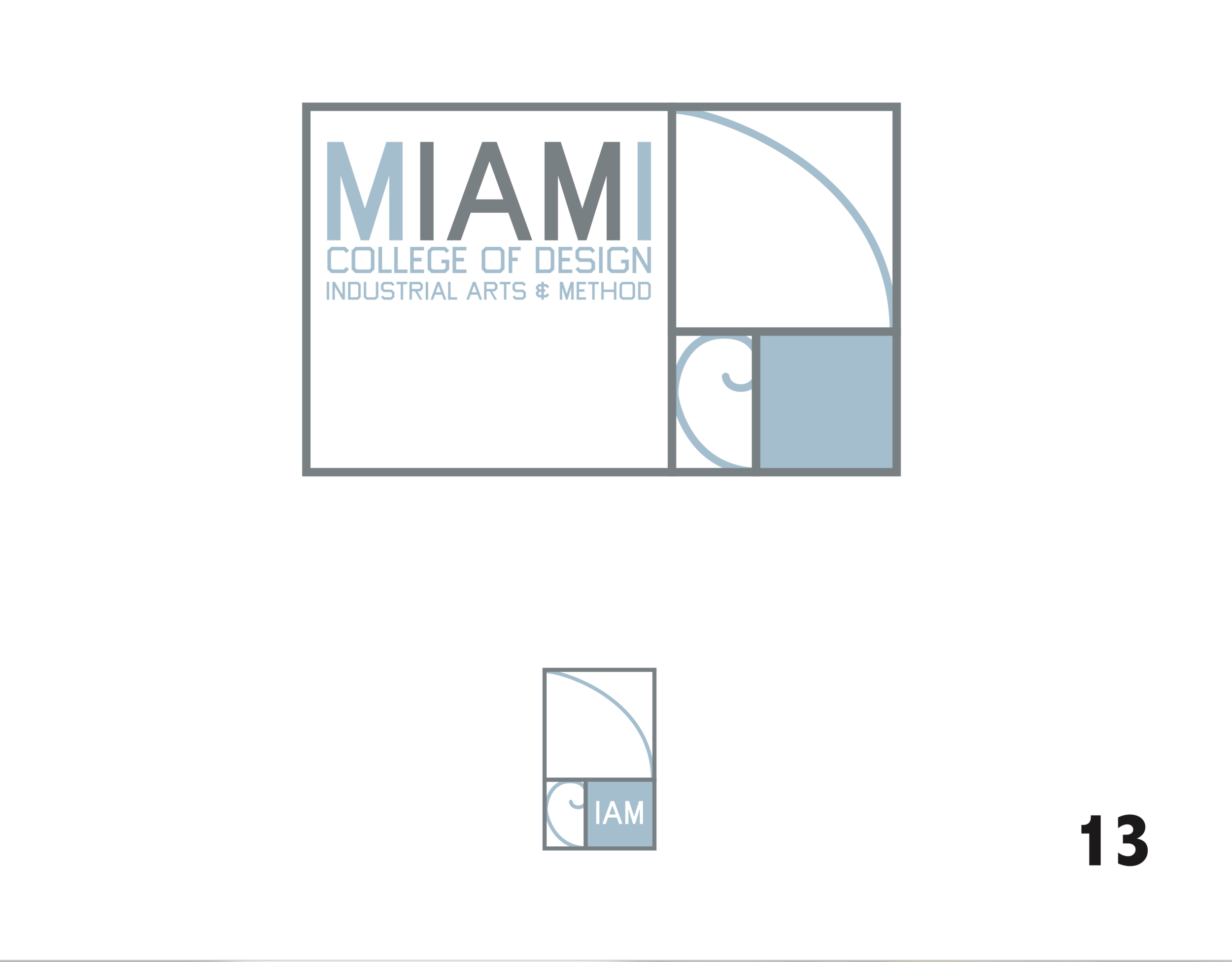
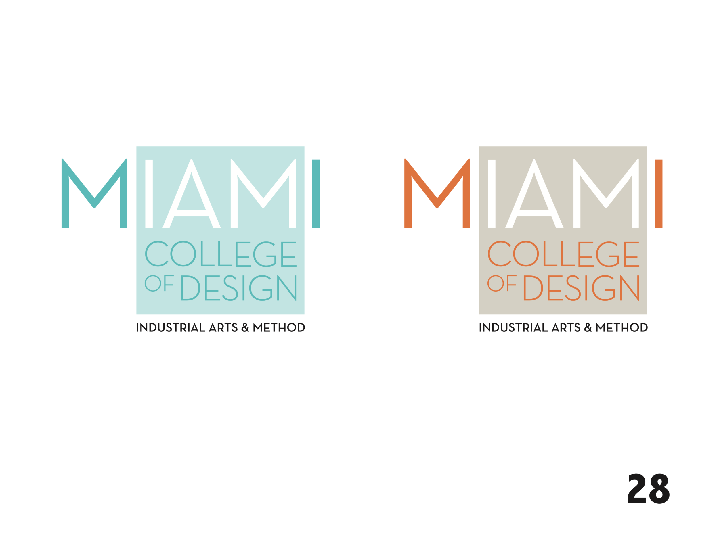
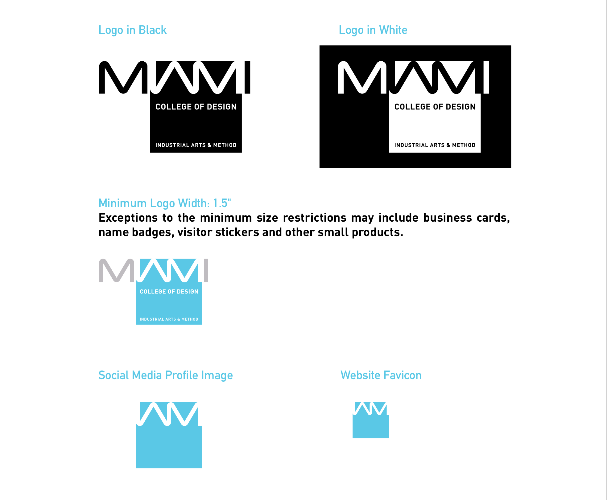
The IAM Logo. Representing both Miami and student transformation.
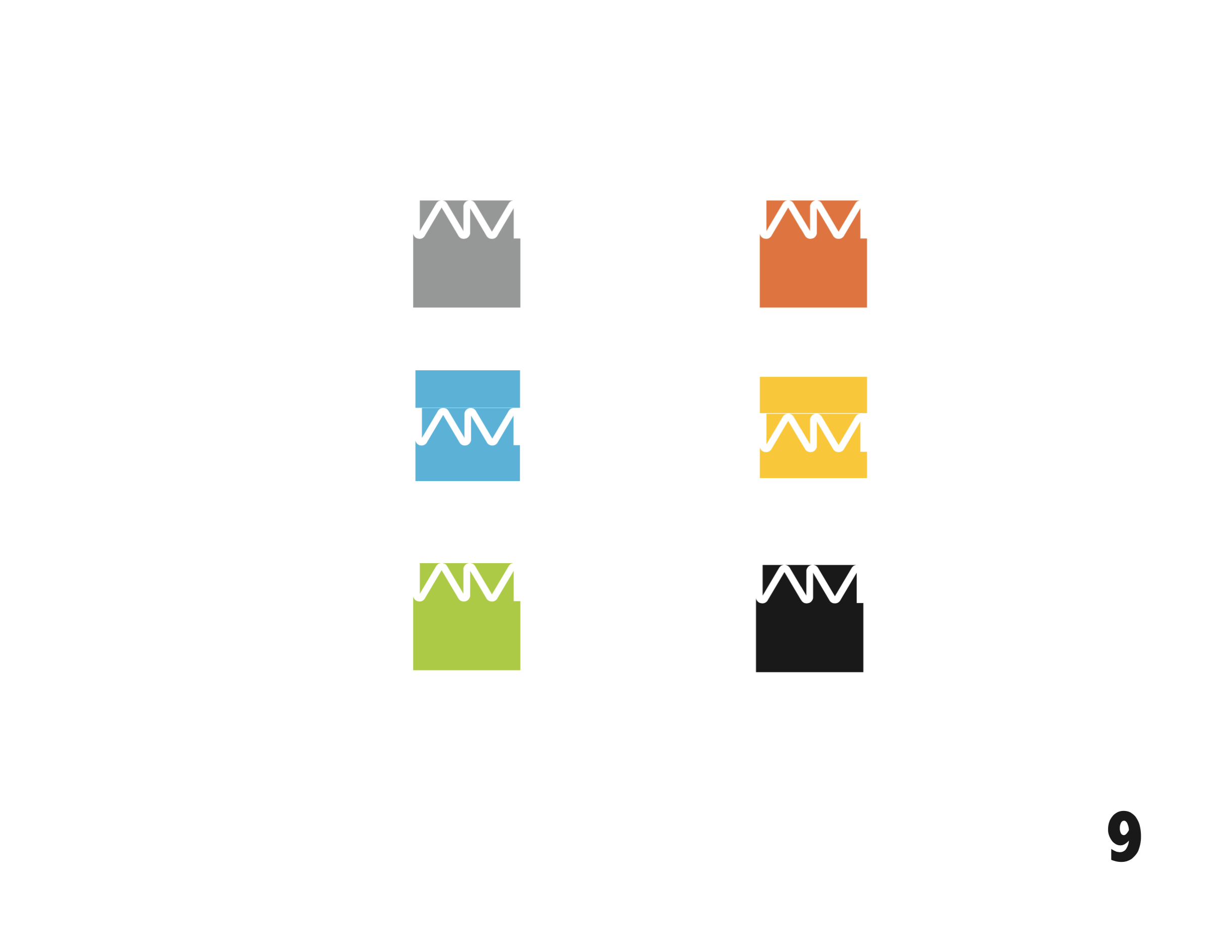
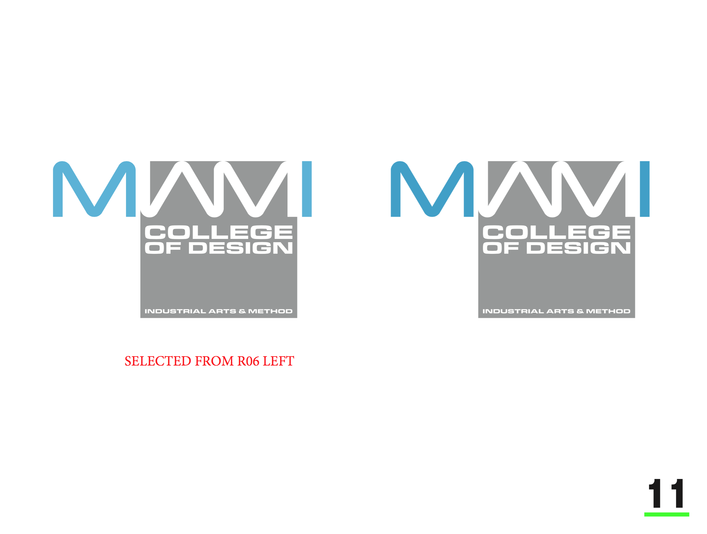
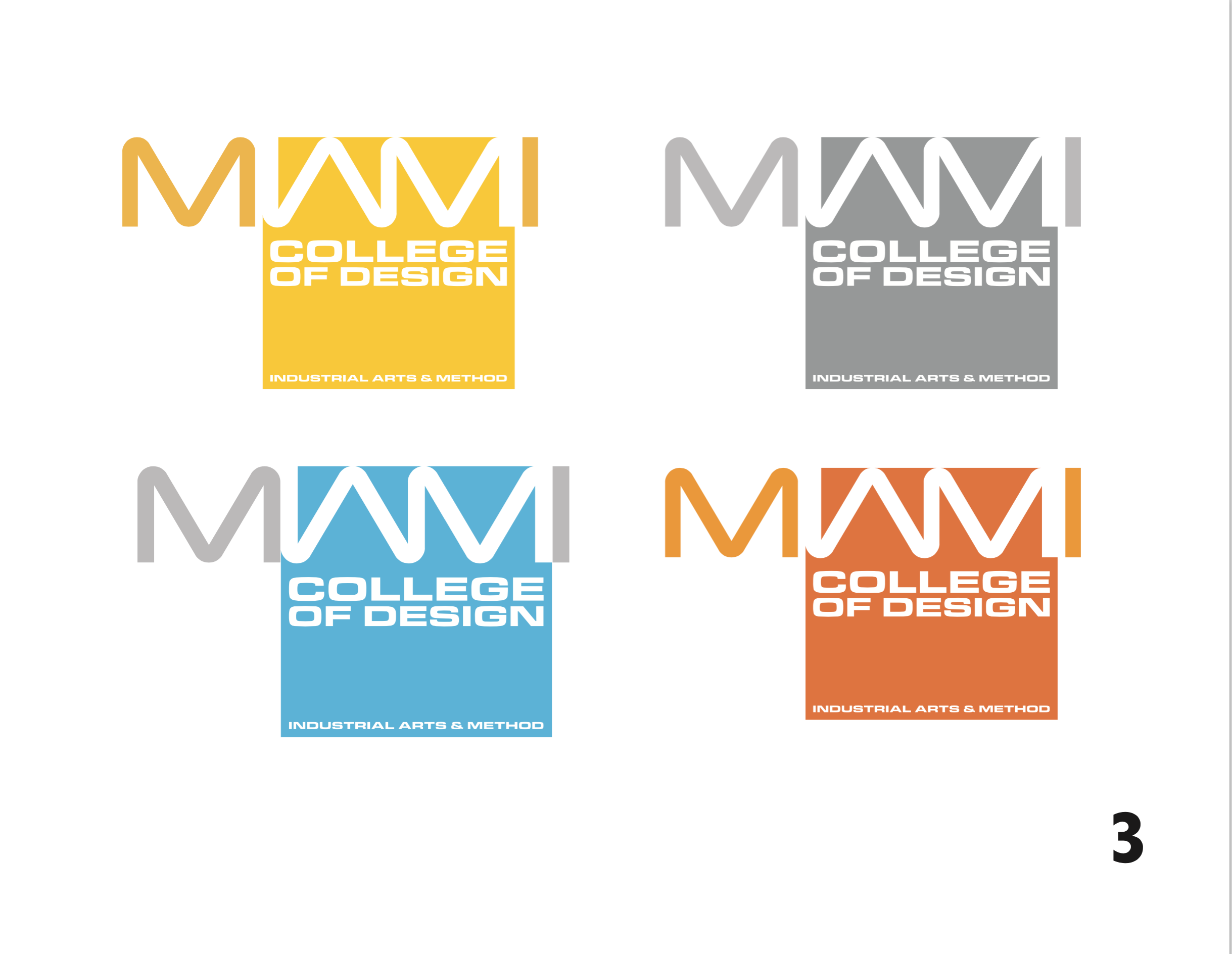
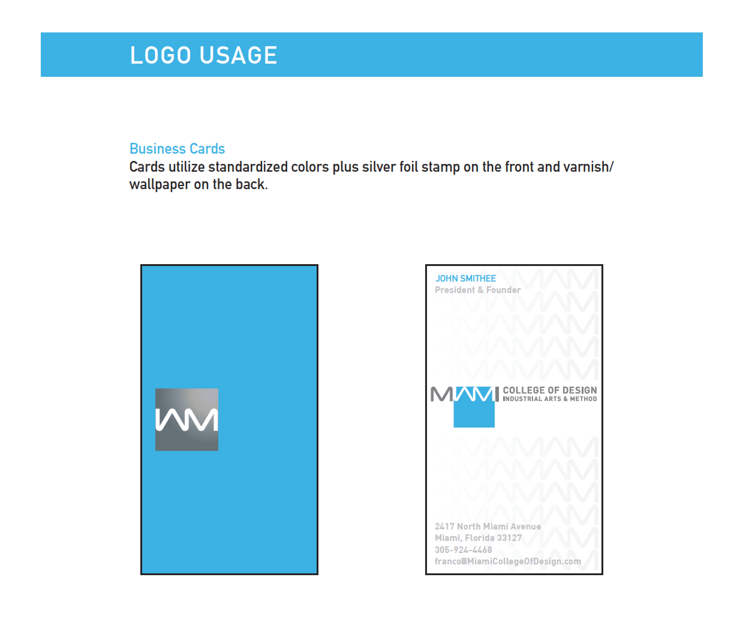
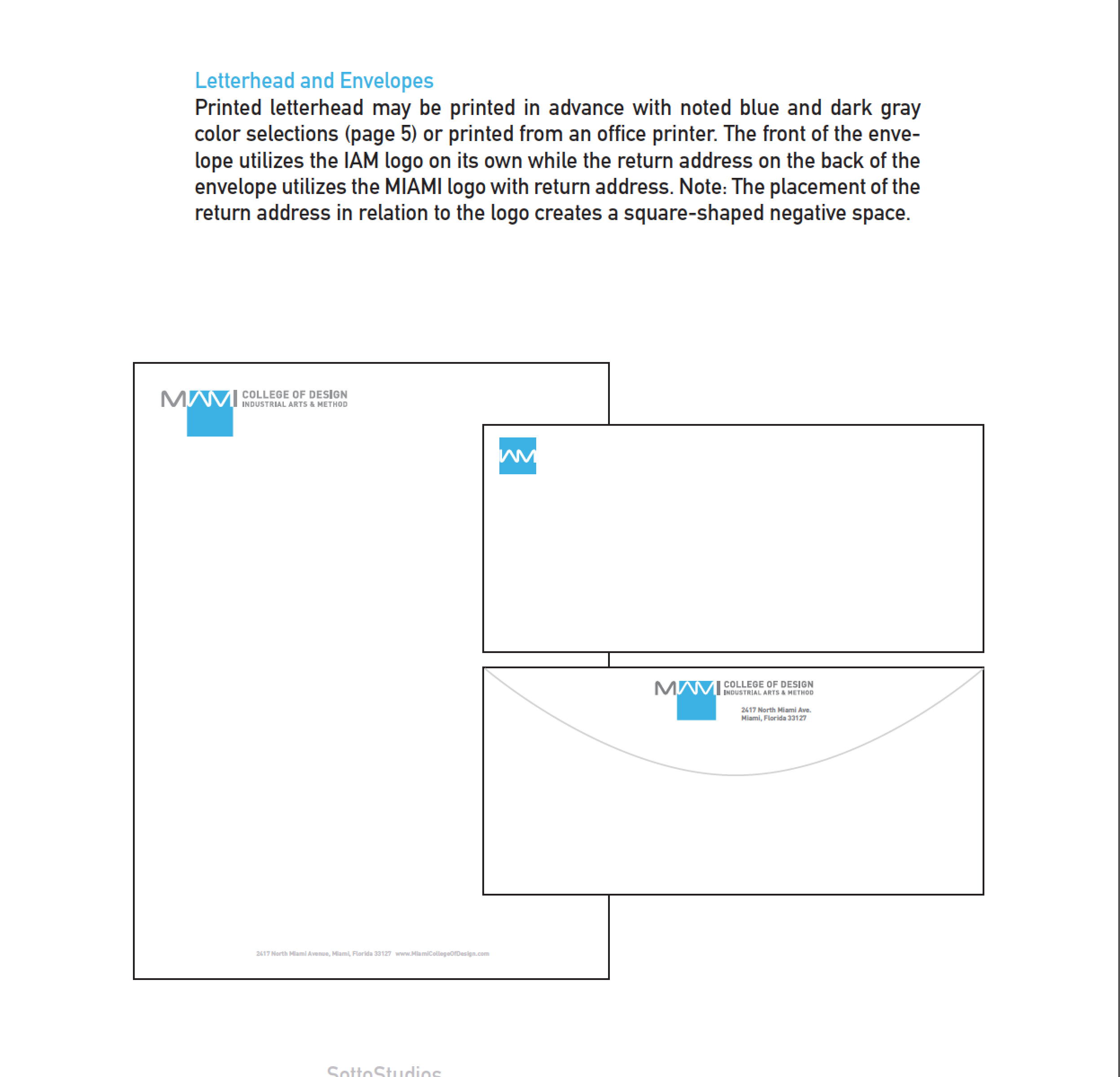
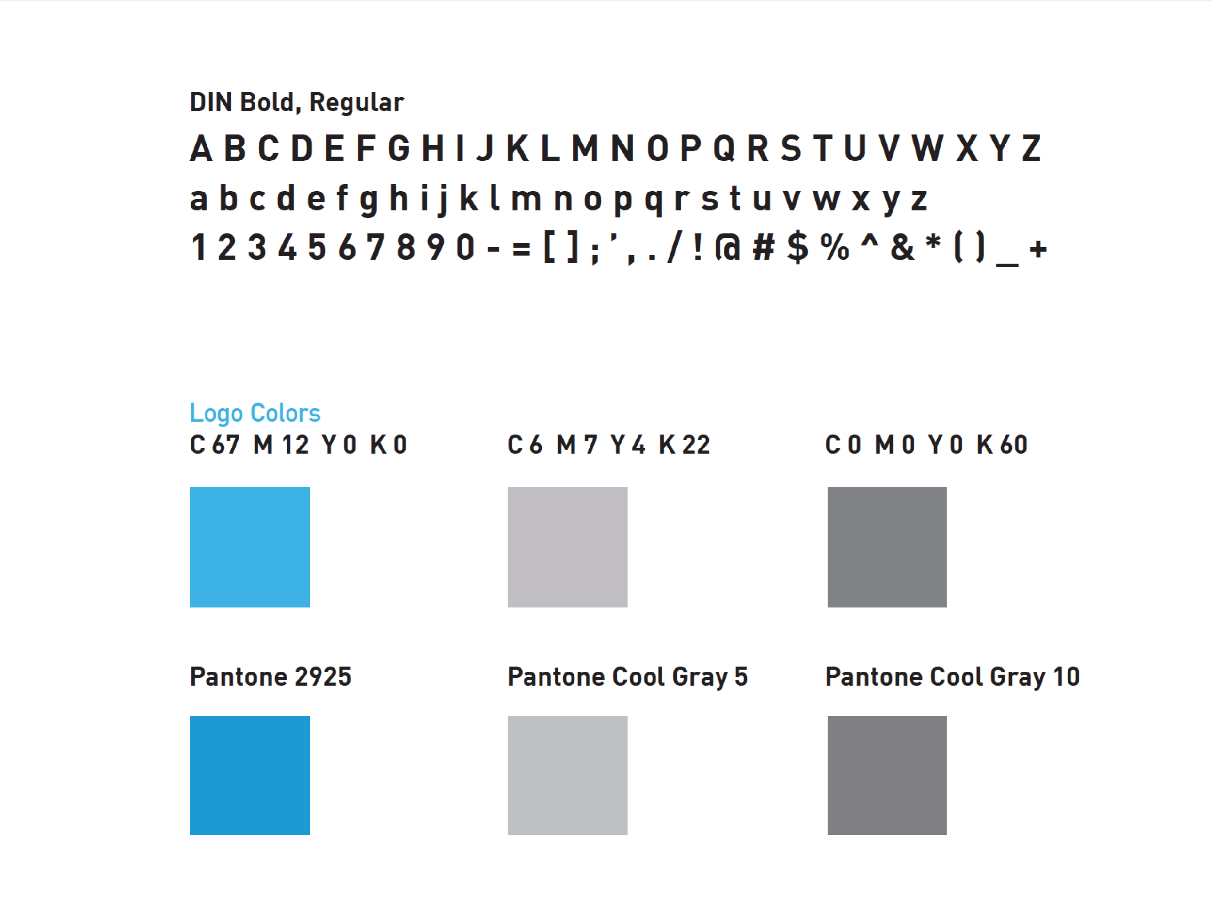
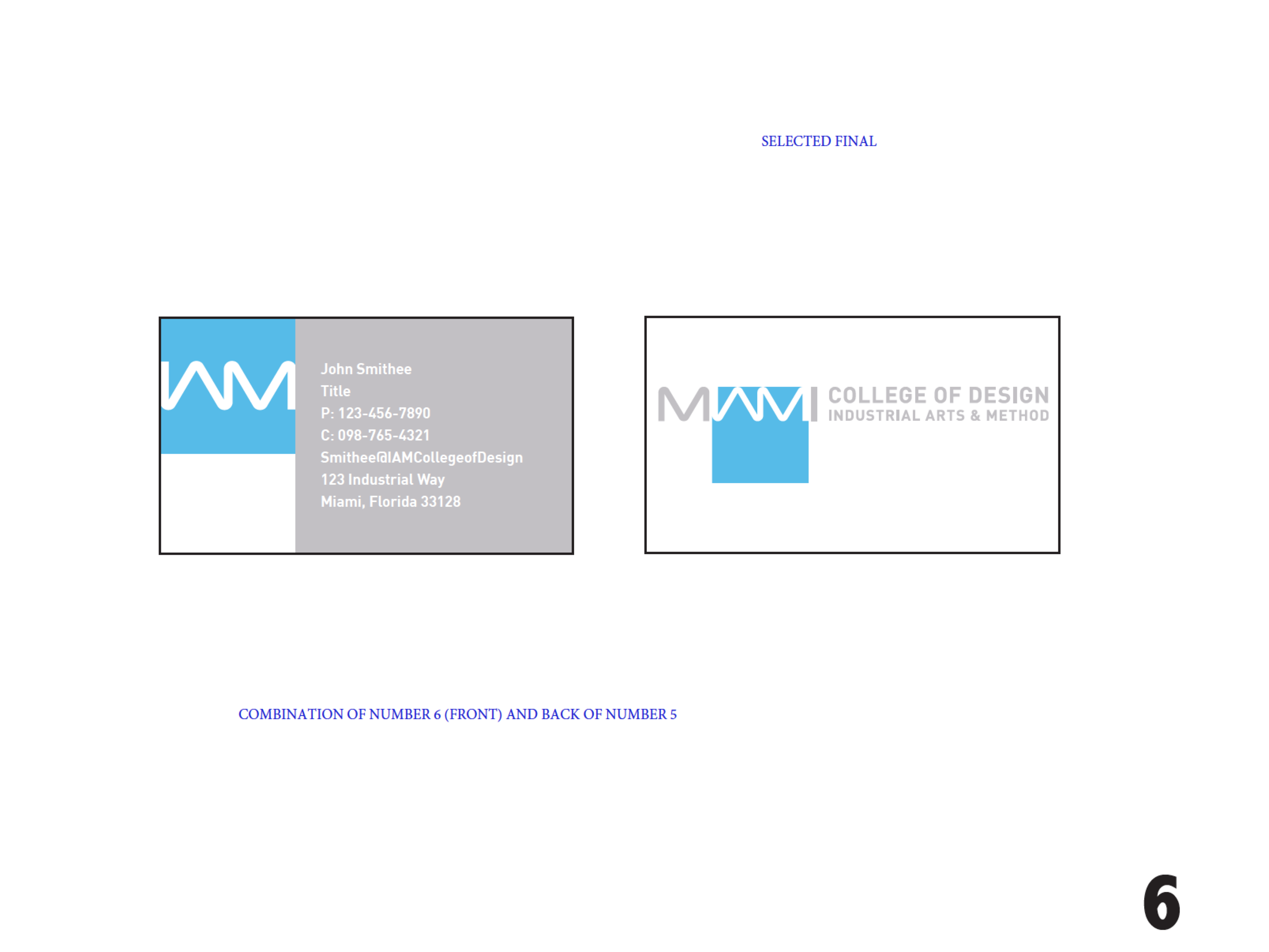
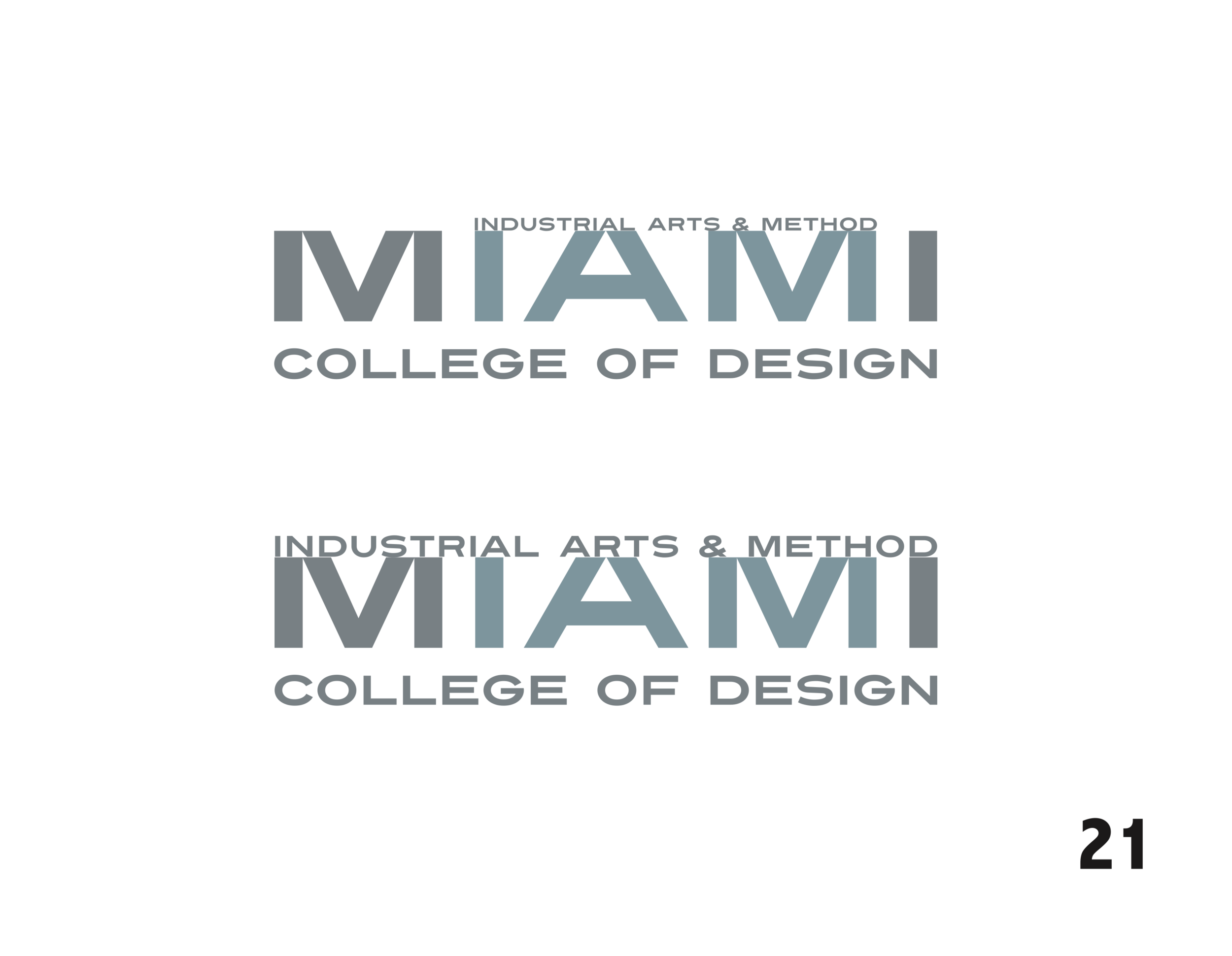
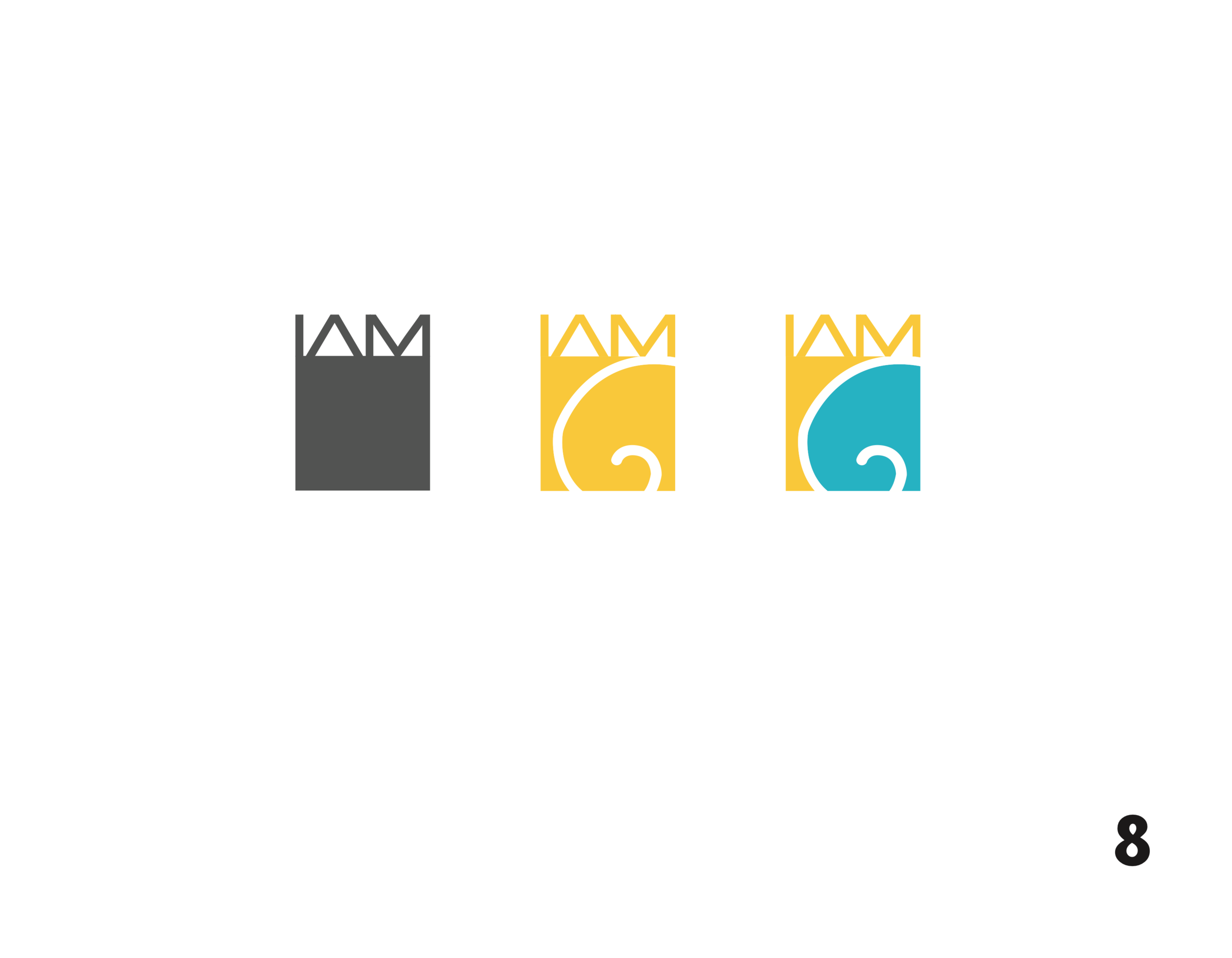
As a means of bringing you into our creative process of integration, we decided it might be good for you to see a preliminary presentation slides of alternate logo concepts as a stream of consciousness. Through "hits and misses," each design builds toward the solution. We adopted two graphic notions to guide us. The Fibonacci spiral and golden rectangle, as they are early observances of how nature and mathematics intersect. Walter being the math side, and Franco the bio inspired. This was favorably met and as such, we tossed more ideas back and forth. Another revelation we had was that IAM in "Miami" was also the subject that was being taught, "Industrial arts and method." As you might expect, it takes many iterations and explorations before you find the design that really says it all, but we were on to something and they were delighted by the result. This effort culminated in us delivering a MCOD Style Guide that serves as a rule book (some pages are shown below) of what can and cannot be done with the mark. Our work continued with many sketches as to what the on site experience might be like so the promise is delivered in the actual day to day life of a student.


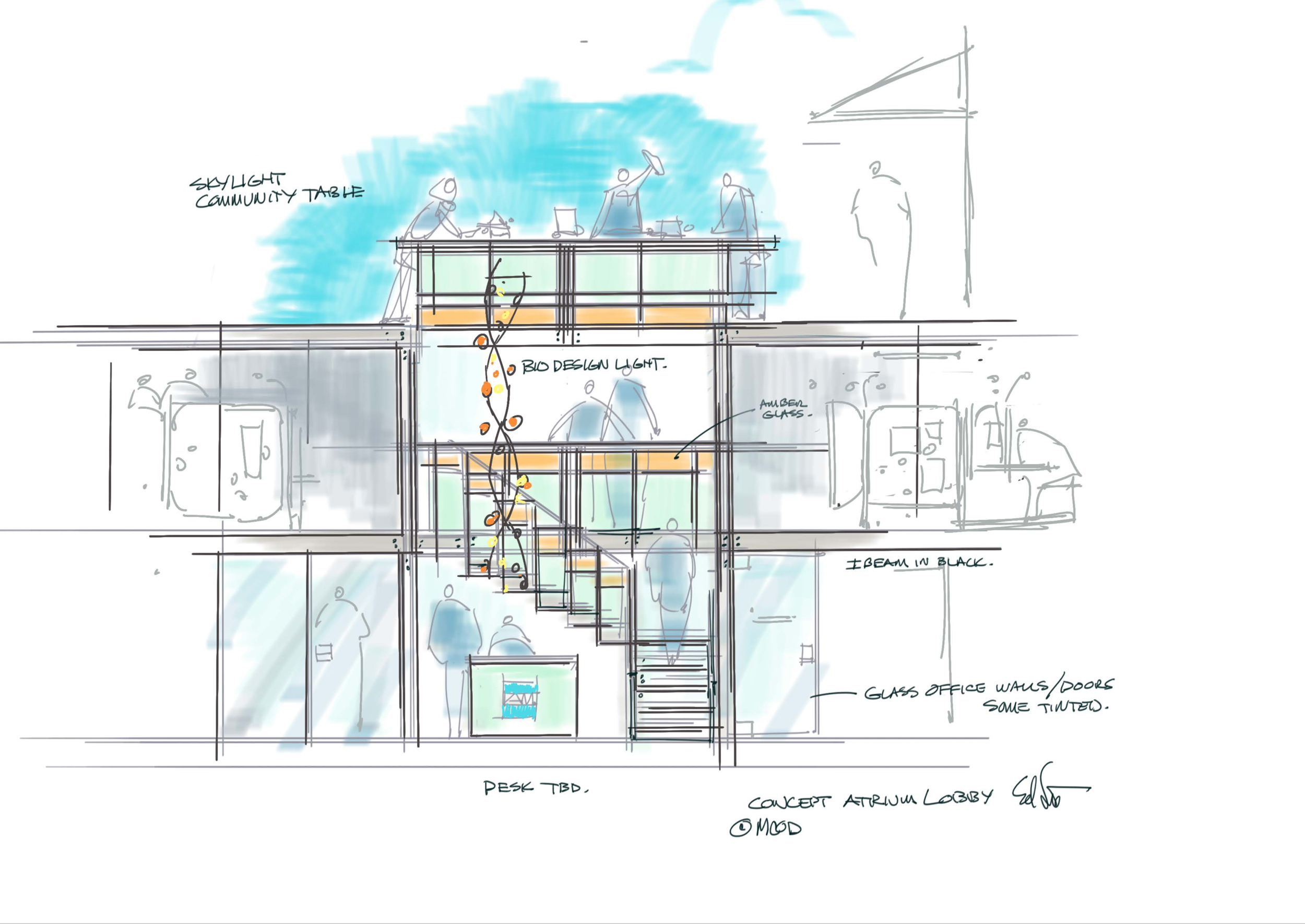
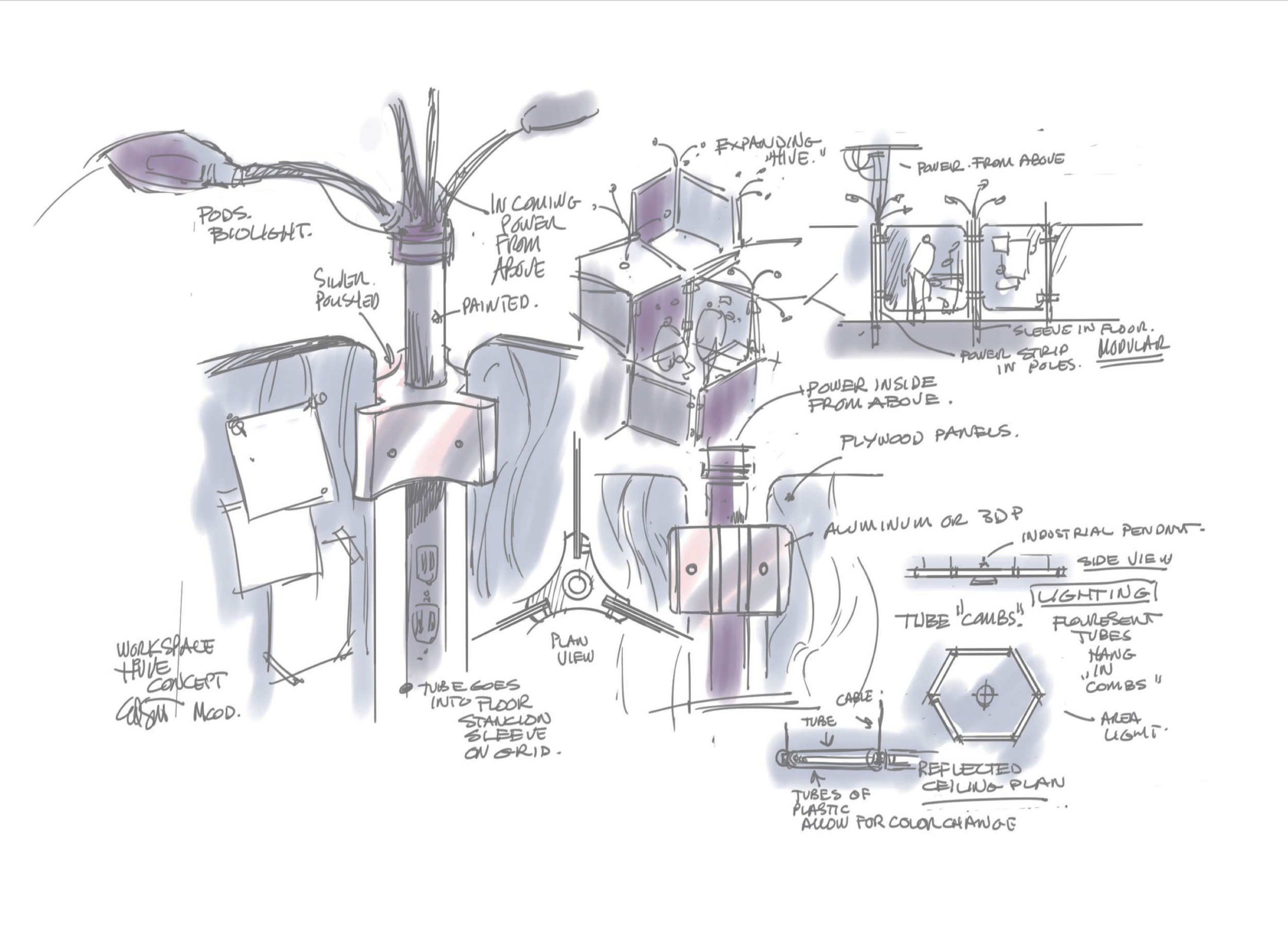


Our biodesign story is embedded in the details, from logo to loggia.

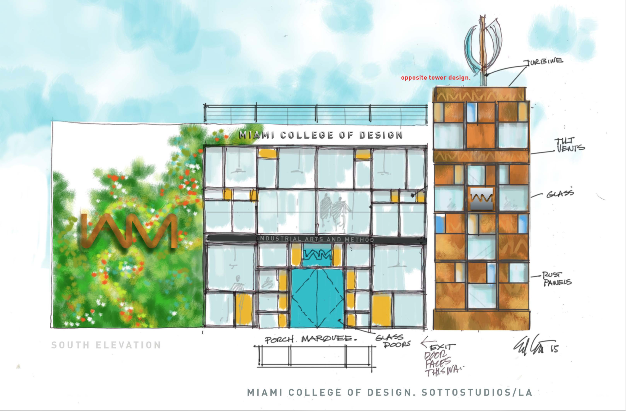
Windows as Golden Rectangle
Every detail matters and even if the budget is modest, every shape still tells a story as seen here in this still window detail that recalls a fractal series of rectangles.

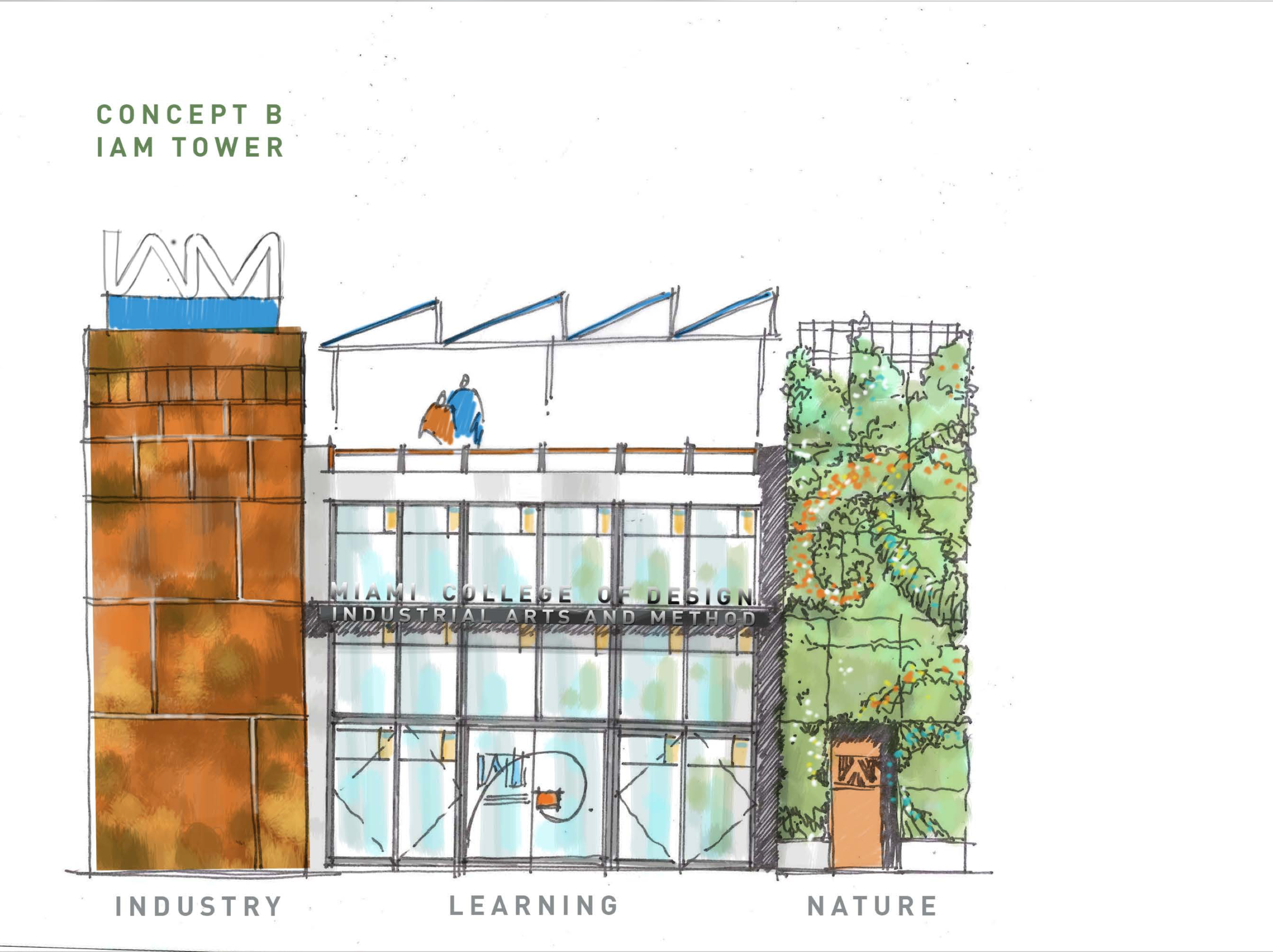
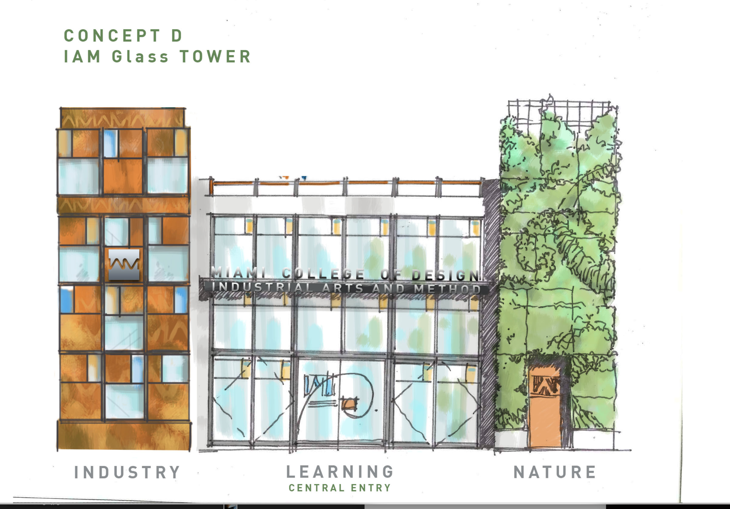
Conceptual elevation
Rough thumbnail sketches spur discussion on how to tell the fractal story in a way that respects the existing structure and industrial sensibility of a communal factory of methodology.