Two out of ten is worth a mention. SkyRanch One (4) and it's host aircraft Embraer's Lineage 1000E (10) designer of the exclusive "portrait window," won the day on Luxatic.com's "Stunning Private Jet Concepts of 2016" list. Full article
SkyRanchOne in Business Insider
Our award nominated interior, Skyranch One, landed another large spread and great reviews in the hottest must-read business daily online. See more here.
Building Disneyland Paris. 25 years later.
Main Street USA, Disneyland Paris, and how it came to be.
As Disneyland Paris turns 25, and as a part of the park's opening design team, I thought it appropriate to relate a brief "war story" straight from the front lines. This is a tale of the schedule being so daunting, and the project "locomotive" moving so fast, that "laying down on the tracks" at times seemed like the only way to make things right.
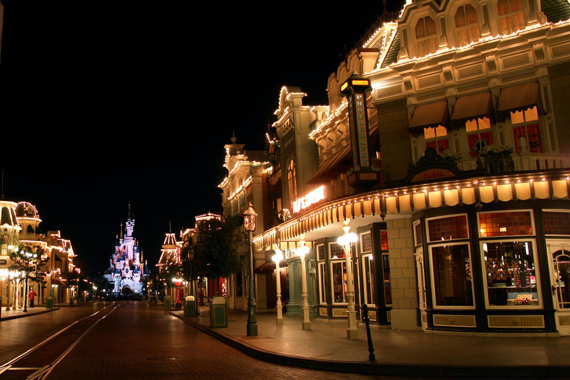
I was on that bullet train and the park was moving like the French TGV toward April 1st, 1992 and nothing was going to stop it. My role was leading the design for the "Main Street USA" section, a "turn of the century" small town experience that recalled Walt Disney's own boyhood. Early on, we felt this concept would not translate well with our European audience, so we turned the clock forward a bit and styled the area more toward the 1920's "jazz age" period, something more familiar and exciting. After a year of design, I go on vacation and return to management having thrown the whole thing out, wanting to "stick to the formula," reverting to what exists in the Magic Kingdom in Florida. So... we were sent back to square one, transported literally back to the 1890's (devastating to say the least.)
Main Street under construction Summer 1991.
Siri reminder: NEVER go on vacation.
In doing so, we were now 12 months behind the other themed "lands" in the park, having to still meet the locked deadlines, working incredible hours for literally years. The only bright spot was to hear Michael Eisner tell me just after we redesigned everything that we were right and that we should have done the 1920's after all.
Desperate times deserve desperate measures.
The time we had allocated to work out the fine details of the intricate moldings, casework, victorian filigree and sculpture was spent reworking the plans a second time, so project management promised the detail would be there, but pushed those time consuming efforts to later phases. As the designer/producer, you begin to sound the alarm upward. The growing mountain of detail that was being deferred, then re-deferred, fell upon sympathetically deaf ears as the schedule roared. You can't slip deadlines either as the other areas were on time, so we made tradeoffs where we could by choosing intricate victorian wall coverings in place of custom millwork, or buying antique lighting and furniture to limit custom design hours. The interiors were making great strides, but the exterior facades were another story. I began to see final drawings that had the “bread" but minus the “ginger,” and on a grand scale. Details were being butchered as they got interpreted in the process! The early use of CAD, computer aided design could not yet mimic classical shapes, so your hand drawn Italianate loggia came out looking like Lego. We brought in set designers from Fox and Warner Bros. to help in redrawing those classical details full-size. We were catching up, but not fast enough. As hard as we tried, we could not catch it all. I felt like Lucille Ball working at the relentless candy conveyor belt, but with less humor. Finally, the cabinet makers were producing shop drawings without developed details at all! In a “triage" effort, we shuttled to each cabinet shop across the English countryside armed with a box of red Sharpie pens, drawing the intended moldings from memory over the crude profiles on the prints at the last possible moment, and made progress, but it was too little too late. Many flawed exterior facades had already been shipped!
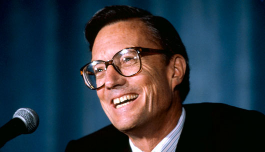
The late Frank Wells, then President of the Walt Disney Company
The final word.
As we neared opening, Disney’s President, the late Frank Wells, paid the construction site a visit. In a one-on-one meeting, he asked me how I thought it was going. This was my last chance to raise the issue, but you can imagine the fallout of going directly to the top. At this point, it was about the product, well worth any political risk. I explained how we had caught up to the rest of the project after being set back a year, but that haste took a toll on the quality in a few key areas. Frank's brow furrowed. Polaroids were delicately drawn from my pocket, placing each still of what we had elaborately done in Florida beside a vanilla example of the same area destined for Paris. The comparison was intentionally stark. "We could fix this if we fund it and literally act today." Awkward silence. Wells was shocked, yet his expression changed and thoughtfully agreed, then passionately approved the project management to fly in several architects from Disney Imagineering armed with an enhancement budget to work directly with me. This time my red Sharpie could “bleed” life back into the facades and we had a crew to pull it off! When you can’t stop a speeding train, you drive alongside and throw in the coal.
The How of Now.
Time being so short, we had to be strategic with what could be done and to the greatest effect. We quickly added more ground level detail (where the guest experiences it) and moldings to each facade right on the primed surfaces! Mickey Steinberg, the project director was funded by Wells to create an onsite effort and pulled out all the stops. A carpenters shop was set up in a merchandise warehouse within walking distance to make the rich cornices and window casings as the “icing” was at last being added atop the “cake" at breakneck speed. By night, we were sculpting art nouveau ornaments in clay to cast, while hand painted detail was applied to the casework via a crew of art students flown in from Ireland. The results were spectacular!
Disney and Co. celebrated the hand-painted Art of the Fairground and Carousel.
The exterior paint crews returned to follow the enhancements to tie-in each new area as it was installed, as we were that close to opening. This cost several million dollars to pull off, and was truly a case where corporate actually saved the day and funded the additional detail that made what we call the "Disney difference." Guests sense the passion and seamlessness, although they can't describe why or point to a particular detail. You just feel it. The same could be said about about a great meal that overwhelms the senses. I never felt the passion it took to get things right was wasted, and I'd like to believe that the richness of the park overall from others that felt the same way has sustained it despite the fact that it has never had a single "E Ticket" scale attraction added in those 25 years. We were one obsessed little family and when I see pictures of those details today, I see the faces of the who delivered on them. To that end, we still owe the beauty of the parks to the vision of those that understand why the guests keep coming back and will do whatever it takes to keep them returning.
I still use a red Sharpie, but thankfully less often.
Thanks to all of you that worked so hard on Main Street and gave 200% to save the day.
NBAA Orlando. Embraer/Sotto team up with SkyRanch concept
Orlando, Florida- The private jet and aviation show in Orlando this week was filled with good surprises and after three years of attending, I really feel like I'm getting to know so many great suppliers and aircraft companies. There is one exhibition in the Convention Center, filled with booths and displays, another at the executive airfield filled with the actual planes to be boarded. All fun. Hoofing the floor and meetings by day, and of course those sponsored mixers at night. Very intense, but you meet great talent form the world over. Our Regatta was featured in JETMODA, a very tony design publication and spent quality time with Publishers Allen McDougal and Natalie Tastle. So fun. Thanks for another great article. This year we are really having a great time with Embraer's Design Veep Jay Beever and his awesome "portrait window", something he shared with us in designing the SkyRanch which we were able to show prospective clients. We explored their new VR configurator and got to design our own Legacy 500 interior while virtually sitting in it. Very cool functionality by Max Pardo and his Corbis/Lightbox team. Hope to be at the next round in Las Vegas. Good Show!
The Embraer Legacy 500 VR configurator
Embraer's VP of Design Jay Beever, inside the Legacy 500, his breakthrough interior.
Why "Immersion" is Job One
Immersion. The term that VR brought front and center (but who knows where "front" or "center" is in VR?) that every brand, architect, and marketer thinks it needs to be chasing, but what is it?
Coming from theme park design decades ago, one interpretation of immersion was the ability to deliver fantasy, the difference between suspending disbelief and breaking the spell. Immersion in a persistent world that continually reinforces through details that seamlessly keep us believing. Any detail that distracts from what we've come to expect as that world's "logic," jerks us out of a blissful sense of escape, such as the sight of a teleprompter at Abraham Lincoln's Gettysburg Address. To that end, as a theme park designer you were constantly on the watch for things in your "land" that contradicted the logic. Immersion and the feeling it conveys is truly job one. It's the difference between a Disneyland and an amusement park.
Virtual Reality 1955
Back in 1955, virtual reality did not exist as a technical platform, but could be achieved in other ways. Walt Disney densely planted a 15 foot high, 360 degree wall of dirt to surround his new Disneyland in hopes of preventing his guests from seeing the orange groves and cheap motels of Anaheim, a death knell to the fantasy he was selling. Walt "rendered" his world with studio backlot architecture, a reality that he envisioned and used trees and skies as his "real time" backdrop. It was truly immersive. In a meaningful way, Disneyland was one, of if not the first persistent virtual world. When at Disney Imagineering, the term for anything that could be seen that conflicted with the themed environs was called a "visual intrusion," even if it was another themed area, like the futuristic spires of Space Mountain being visible over the rooftops of "turn of the century" Main Street USA. As designers of these thematic "lands" in Disneyland Paris ( I had "Main Street USA" for example) we designed so the sight lines of each other's Icon's did not unnecessarily intrude on the other's reality. All to maintain the illusion. In today's theme parks the "real world" can creep in ever slowly and threaten to erode the delicate immersive balance of "suspending disbelief", so adding a Starbucks to the corner of a 19th Century "Main Street" can create tremendous controversy with fans, although it has a line down the block. Why? It's not about coffee, it's about "breaking the spell" and fans see the danger sometimes when the company does not.
Portalus Rift?
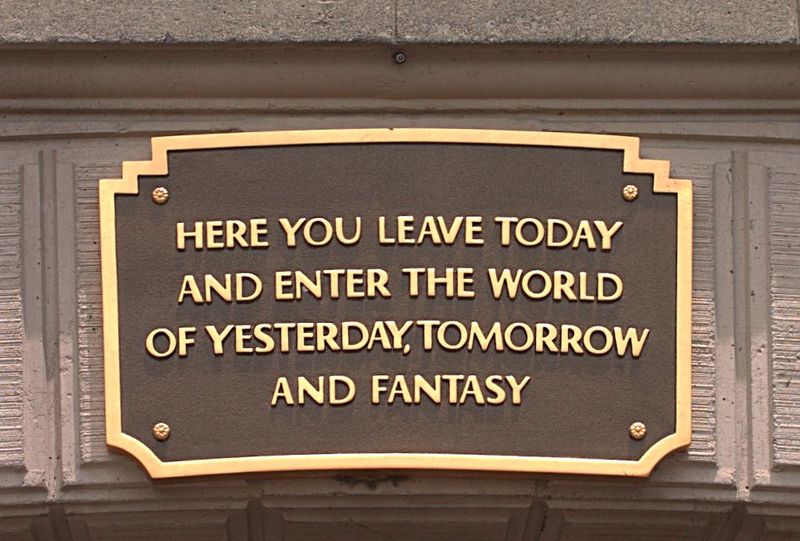
Back in 1955 there were no Google or Oculus headgear, so Walt conceived a portal (not unlike Stargate) to take us from the real world to his immersive one. At the park's entrance there are two literal portals beneath the railroad station penetrating that berm. To be sure guests understand that their reality is about to change, there are even plaques over each portal that Disney personally wrote. To me, this is the single biggest cultural breakthrough in theme design. Let the immersion begin. The plaque reads.
As a kid, like many of us, I fell in love with Disneyland but did not know exactly why. It was the power of being in another world and the more I tested it the more real it became. Immersion into a reality I wanted to escape to. Now when I visit other immersive worlds like Venice, Paris, or even the expanse of Yosemite, it's the seamless continuity of emotion that conjures that "spell" unique to each experience. Smelling the pine, or the croissant, or the canal! It's so much more than pixels.
Licensed to Immerse
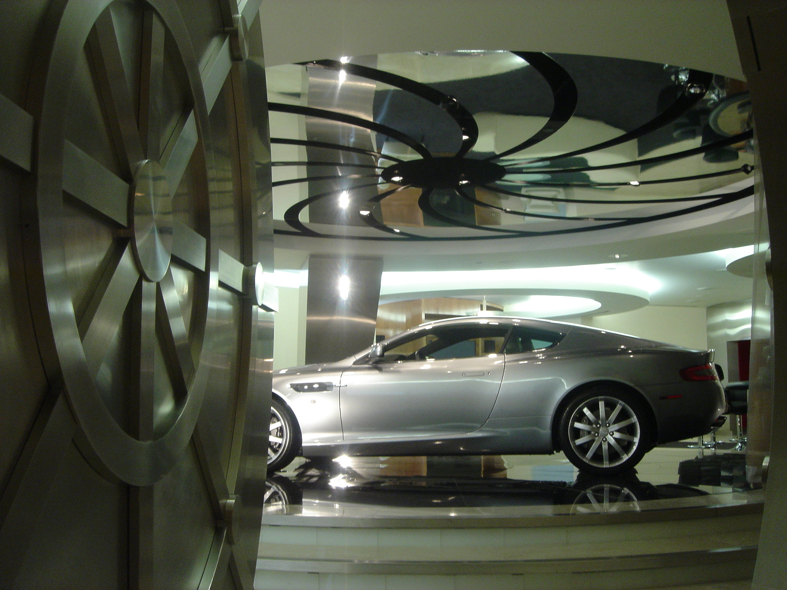
In experiential design we think the same way and start with the emotion, or spell that binds us and work backwards into a reality that maintains it, knowing that the details go beyond architecture or graphics, but are sensory, just like Venice. It causes you to think "total" and see the experience as a system. Designing a restaurant or a car showroom can be the same way, but it's more important to immerse someone in their aspiration than just use nice finishes. This ClubAston showroom is more about first immersing the customer into an aspirational James Bond style experience and presenting the car in that context, than just using elegant materials from the brand book. We set the cinematic stage and customers feel compelled to play the part. Galpin Aston Martin became the number one dealer in the country.
In fact, I've seen research that said that when people are immersed in another optimistic or safe reality, they are more inclined to accept advertising messages (like a theme park sponsorship) if they are part of the seamless reality. So immersion even has a return on investment. Certainly people will pay more to satisfy emotional needs ($10k for a seat at the Cubs Game 3 to be a part of history) than merely physical ones if they are compelling. Here's a brief video that explains experiential immersion at Disney a bit further.
Net-net. Immersion is a spell worth keeping. Thanks for your attention.
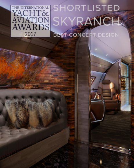
Shortlisted for 2017 Yacht & Aviation Design Award. Best Concept.
Teaming up with Embraer Executive Jets, SottoStudios has once again has made the short list for the upcoming 2017 Yacht and Aviation Awards for it's breakthrough SkyRanch One design. Embraer lent it's revolutionary "portrait window" to the design, setting it even further apart. Set in the lush Embraer Lineage 1000e, SkyRanch, like it's previous nominee Skyacht One, hopes to get the nod in Venice, Italy next year at the Awards Ceremony. Thanks to Jay Beever, his team at Embraer and best to all nominees. We'll let you know when voting opens.
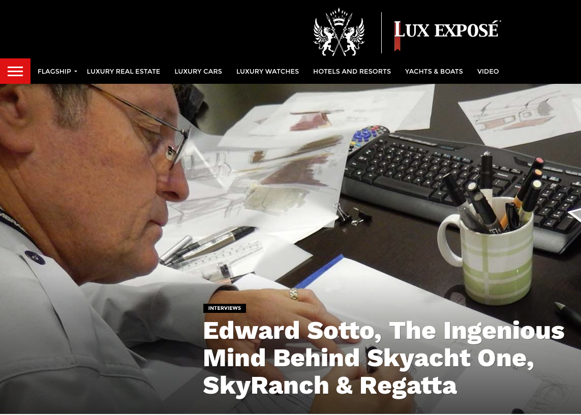
In-depth interview on our new projects.
Lux Expose takes us behind the scenes of bespoke design.
Recent articles and interviews in the press.
Eddie Sotto describes his life in the Foggy city in Luxury London.
Skyacht One and Eddie are featured in this profile on BBC.com
Paris Match raves about Skyacht One.
LuxExpose calls Skyacht One the Aeronautical masterpiece.


