Noted Disney Historian Jim Korkis interviews Eddie about the unbuilt "Lafitte's Island" for Disneyland, Disney Legend Herb Ryman, Inspiration surrounding Disneyland Paris, his thoughts on Walt himself, and more. PART ONE HERE
Blooloop Interview: Theme Park Wars. News from the front.
"Experiential Designer" Yeah, right.
Currently featured on linkedin.
"Experiential designer" was a relatively unknown title when I began using it more than a decade ago. Brooks Branch, a brand guru and client at the time described what I was doing for him as such and so the moniker stuck. For the first few years it had to be explained, but now it's everywhere and might need explaining again. Like "storytelling", "experiential" has spread across the brand landscape like margarine to the point where applying underarm deodorant has suddenly become an "experiential storytelling journey". Yeah, right.
The Snowjob.
So to that end, it might be relevant to revisit what made Brooks choose that label in the first place. I'm not the traditional "creative". Not being an architect, but designing architecture, not being an acoustician, but creating sonic environments, and not being a screenwriter, but penning brief project narratives, you realize that you're designing spaces as a total experience. Seeing things from every sensory perspective, then using design to immerse guests in a feeling. We certainly take in experiences in real time using all of our senses; so why not design that way? Who makes horror movies without sound? What chef ignores what his meal smells like? It all matters. Just visit a space where something feels kinda "off ", then it's a "de-tuned" experience. But what is an "experience"?
One dictionary described it as "a child's first experience of snow", a sensory feast. You taste it, touch it, crunch it, and watch it blanket a forest. It's bitter cold, it's fractal, and even transforms while melting in your hand, and if you're fast, it's nature's LEGO to erect a Snowman.
Growing up as a kid in LA with a fascination for places like Disneyland, I longed to escape the gas stations on every corner for alternate "worlds" that were rich and immersive, but not all places made the cut. Fantasy relies on the suspension of disbelief and thematic contradiction trashes it. Imagine watching a Western only to see a Tesla drive through the scene. The car is a contradiction to that world and breaks whatever spell it had on you. Like seeing a plastic vault door in a bank would cause you to lose trust. Tiki Bars do immersion well, as those umbrella drinks support the "savage" logic or narrative (or you're too bombed to care.) Venice, Italy is really good at immersing us in its "world". Void of distractions like cars, it's a rat's maze of fractured streets that pay off with grand squares, singing gondoliers, Cappuccino and Campari; all held together by its own crumbling yet harmonious architecture. All in, we get a sense of the Renaissance by immersion. Venice succeeds eternally because of it's seamlessly unique experience (until they add a Marriot.)
After being a designer at Disney Imagineering for 13 years, developing "lands" (like the victorian "Main Street USA") in places that already are adult theme parks like Paris, it dawns on you that the "real world" is much like the themed one, only with more contradictions. Leaving Disney to set up my own practice 10 years go, I sought to export some of that "form follows feeling" sensory experience into brand development and place making. Even if it was not themed per se, the process of starting with the emotional "wow" then designing in total to sustain it, seemed to have value. Why?
The Example.
To illustrate, we were tapped to create "Rivera", a chef driven restaurant that as an experience, had to define "modern latin dining." It was to have it's own abstract narrative and logic that was to be designed to match the chef's "mayan modern" vision. I created a playlist of music that I imagined guests would hear while dining. It truly guided a unique design, but that wasn't enough. To communicate this beyond presented artwork, we gave each potential investor my soundtrack to listen to so they too could imagine being there opening night. We got the money, opened the restaurant, and each investor was thrilled to hear their music scoring the real experience, which exceeded their expectations. We used one sense to convince another, by communicating the "wow" in advance bringing those investors into the soul of the idea. To me, the big win is in the synthesis of design with those sensory elements. There is an exponential power when they all fire seamlessly as one, like a full orchestra over a soloist.
"Experiential design scores the senses, then tunes them to shatter the mind's glass"
The Takeaway
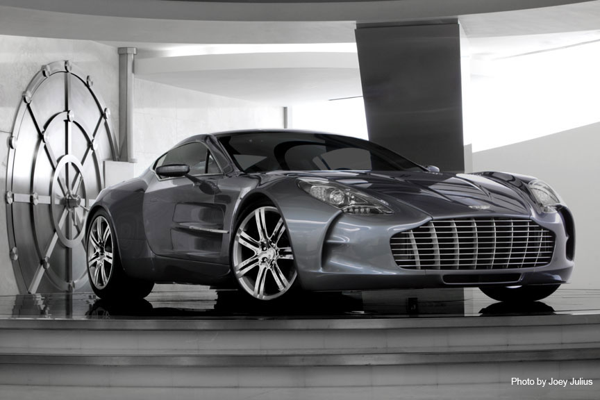
So what's the point? It's to realize that the senses matter and that as much as the process typically is to just hire an architect, agency, or an interior specialist, as humans we experience so much more. De-silo the players and make it all important. Galpin's ClubAston sells more than a car, it sells "James Bond", so we helped craft an experience to convey that aspiration, from music to martinis and it lives in a vault (opening image.) Experiential design scores the senses, then tunes them to shatter the mind's glass. I try to see things as scenes, as a camera does, where everything is there to support and collectively communicate a feeling. Having set designers as an inspiration and film in my family, I was fortunate to grow up around this organic story driven process, to design in a way that makes me prioritize by emotion, then love each detail. You can too. Concept is King and its execution deserves "special forces" as this stuff is not typically easy! Hope that is helpful to you, and thanks again Brooks!