Covid Quarantine brings out the “podcaster” in people, and Eddie is no exception here. This show, unlike the typical theme park history podcasts, focuses on how theme parks are affected by the COVID19 virus, how reopening may hurt the desire to return, and what can be done long term to reimagine the experience in a way that brings people back. Our host, TV producer Heath Racela also expands the conversation into the realm of design and storytelling in the film industry. He asks Sotto to explain how the motion picture production design process compares to and inspired the design of theme parks and attractions.
SottoStudios is out to reimagine the Mall.
This article is Sotto's highest read piece currently on Linkedin.
Malls are "Sofa-cating"
Southern California's Mall developers (Westfield in particular) are fighting the current "brick and mortar" retail crisis that is shuttering many big box mega stores by "getting personal." Experiential design is finally taking hold for some with swinging benches, lounge chairs, fire pits, fountains and lots of green. All of this "social flypaper" is threaded right through the middle of the many of the same shops we're used to seeing, hoping to prop up the aging mall business model. Sure, there are more wellness and yogurt options to fuel those outdoor back rubs. It seems that weaving retail into "outdoor rooms" as a millennial alternative to your apartment balcony and rusted hibachi may be a novel way to draw crowds. It got me there and it felt great. Internally dubbed "lifestyle" centers, these new offerings did make me wonder how truly "social" these areas are, as we see so many scanning their devices. What next? A coffee? New shoes? A scented candle? Devices are hard to compete with, or maybe those lounging shoppers are conducting a fireside shopping spree on Amazon? The question is, does creating a "village" really result in more sales, or do we have to do more long term than transplant people from their sofa to ours? The conventional wisdom would be that they are more likely to buy something in a retail living room than their own.
It takes a Sofa Village
As an experiential designer it excites me to see this new direction and feel that it is only the groundwork for the next evolution. Even the appeal of movie theaters as a magnet is in question so it's all an open question. These big boxes that become empty are, of course, terrifying to the mall operators who are used to leasing space versus reinventing their business. We see those boxes as big opportunities to reimagine something exciting. Change is here.
What won't change.
Ironically, Amazon's Jeff Bezos said it best when asked how to cope with continual change. He pointed out that it's best to look at the things that will not change and build on that. In his case, price and speed of delivery. No one wants something more expensive and slow to your door. People will always want to get out of the house at some point, especially as long as there are dysfunctional families. In the case of experiential design, we look to build on creating emotion and really start with that "wow!" and work backwards into how to express it. We look for constants that will bring people out repeatedly. We see sensory design as "systems" and this is important as the mall is holistic experience, something lessors seldom understand as leasing is by necessity a piecemeal negotiation. In time, the identity of that mall experience can be highjacked by the cumulative effect of many disparate lease deals. In fact, the tenant mix to us are like an orchestra, where the symphony takes precedent over the soloists.
"I love your ______"
Are retailers partially to blame? Maybe. As a shopper, at times have you encountered "brick and mortar" retail interactions to be a negative experience compared to online solitude? I've sensed that the staff in too many cases have been cheerily trained to "over serve" you by approaching endlessly till you leave, dispensing hollow compliments, and other annoying practices. Each staffer is oblivious to their teammates so they sequentially approach you with the same canned pitches. Devices may have shifted our social expectations of a good experience to an "on demand" social model, not a "stimulus and response" fake chat. Perhaps we only want interaction when we need it, versus a human pop-up ad? Seems the online world often has more product information and you can browse without interruption. See how conditioned I've become already! So there has to be a bigger and better reason to go than that. Best Buy and others are looking to let you try before you buy. Love that too.
"Merchant-dising."
To that end, it seems "the Village" concept of weaving in social culture as a magnet, strives to rise above the tenants themselves, like "San Francisco" is the destination and Ghirardelli affirms it. Sounds good. In the "lifestyle" center business, there seems to be more "creative risk," as customers are coming for the shared experience of the mall with shopping as a repeatable byproduct. The better stores stoke this by being "merchants", rather than "retailers". "Merchants" continually bring new things that they know will thrill their customers (like Trader Joe's, or Apple used to, ) but "retailers" have no idea why something sells, they just dispassionately offer it. You want to enter a store and feel the fanatical love the staff has for their product, see what's new, perhaps check in with that staffer who is an expert on the product you saw last time. In the old days of buying records it was the "roadie" behind the counter that toured with the bands you love and knew what was about to be released. To me, "authenticity" in retail or the lack of it, is one reason online is winning. As you see, the tenant mix becomes far more curated as you are trying to satisfy or affirm an aspiration in the shopper. It's not just the social spaces, everything matters when you are creating a system of experience.
Variations on a theme.
This kind of "hard fun" is exciting and a really good assignment in the reimagining process of what mall can be. It's creating that feeling of well-being, reassuring us all that our quality of life exists and that we ourselves are relevant within that. Coming from years in theme park design, "lifestyle"malls seem to have become more themed like Disney's Main Street, and to some, Disney's Main Street has become more of a mall. Funny how that "art imitates life imitates art" thing works?
Exciting times. See you at the firepit.
Edward Sotto runs SottoStudios/LA, an experiential design and brand studio in Los Angeles. More articles from Eddie.
"Experiential Designer" Yeah, right.
Currently featured on linkedin.
"Experiential designer" was a relatively unknown title when I began using it more than a decade ago. Brooks Branch, a brand guru and client at the time described what I was doing for him as such and so the moniker stuck. For the first few years it had to be explained, but now it's everywhere and might need explaining again. Like "storytelling", "experiential" has spread across the brand landscape like margarine to the point where applying underarm deodorant has suddenly become an "experiential storytelling journey". Yeah, right.
The Snowjob.
So to that end, it might be relevant to revisit what made Brooks choose that label in the first place. I'm not the traditional "creative". Not being an architect, but designing architecture, not being an acoustician, but creating sonic environments, and not being a screenwriter, but penning brief project narratives, you realize that you're designing spaces as a total experience. Seeing things from every sensory perspective, then using design to immerse guests in a feeling. We certainly take in experiences in real time using all of our senses; so why not design that way? Who makes horror movies without sound? What chef ignores what his meal smells like? It all matters. Just visit a space where something feels kinda "off ", then it's a "de-tuned" experience. But what is an "experience"?
One dictionary described it as "a child's first experience of snow", a sensory feast. You taste it, touch it, crunch it, and watch it blanket a forest. It's bitter cold, it's fractal, and even transforms while melting in your hand, and if you're fast, it's nature's LEGO to erect a Snowman.
Growing up as a kid in LA with a fascination for places like Disneyland, I longed to escape the gas stations on every corner for alternate "worlds" that were rich and immersive, but not all places made the cut. Fantasy relies on the suspension of disbelief and thematic contradiction trashes it. Imagine watching a Western only to see a Tesla drive through the scene. The car is a contradiction to that world and breaks whatever spell it had on you. Like seeing a plastic vault door in a bank would cause you to lose trust. Tiki Bars do immersion well, as those umbrella drinks support the "savage" logic or narrative (or you're too bombed to care.) Venice, Italy is really good at immersing us in its "world". Void of distractions like cars, it's a rat's maze of fractured streets that pay off with grand squares, singing gondoliers, Cappuccino and Campari; all held together by its own crumbling yet harmonious architecture. All in, we get a sense of the Renaissance by immersion. Venice succeeds eternally because of it's seamlessly unique experience (until they add a Marriot.)
After being a designer at Disney Imagineering for 13 years, developing "lands" (like the victorian "Main Street USA") in places that already are adult theme parks like Paris, it dawns on you that the "real world" is much like the themed one, only with more contradictions. Leaving Disney to set up my own practice 10 years go, I sought to export some of that "form follows feeling" sensory experience into brand development and place making. Even if it was not themed per se, the process of starting with the emotional "wow" then designing in total to sustain it, seemed to have value. Why?
The Example.
To illustrate, we were tapped to create "Rivera", a chef driven restaurant that as an experience, had to define "modern latin dining." It was to have it's own abstract narrative and logic that was to be designed to match the chef's "mayan modern" vision. I created a playlist of music that I imagined guests would hear while dining. It truly guided a unique design, but that wasn't enough. To communicate this beyond presented artwork, we gave each potential investor my soundtrack to listen to so they too could imagine being there opening night. We got the money, opened the restaurant, and each investor was thrilled to hear their music scoring the real experience, which exceeded their expectations. We used one sense to convince another, by communicating the "wow" in advance bringing those investors into the soul of the idea. To me, the big win is in the synthesis of design with those sensory elements. There is an exponential power when they all fire seamlessly as one, like a full orchestra over a soloist.
"Experiential design scores the senses, then tunes them to shatter the mind's glass"
The Takeaway
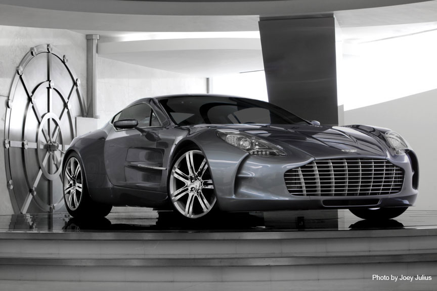
So what's the point? It's to realize that the senses matter and that as much as the process typically is to just hire an architect, agency, or an interior specialist, as humans we experience so much more. De-silo the players and make it all important. Galpin's ClubAston sells more than a car, it sells "James Bond", so we helped craft an experience to convey that aspiration, from music to martinis and it lives in a vault (opening image.) Experiential design scores the senses, then tunes them to shatter the mind's glass. I try to see things as scenes, as a camera does, where everything is there to support and collectively communicate a feeling. Having set designers as an inspiration and film in my family, I was fortunate to grow up around this organic story driven process, to design in a way that makes me prioritize by emotion, then love each detail. You can too. Concept is King and its execution deserves "special forces" as this stuff is not typically easy! Hope that is helpful to you, and thanks again Brooks!
Make your weakness your Superpower. By Eddie Sotto
Several years ago I was summoned to meet with legendary Las Vegas mogul Steve Wynn. He was building a new casino and had a wild idea he wanted to develop. Wynn wanted to put of all things, a car dealership opposite his gaming tables. I just couldn't imagine someone in a tux sparking a Dunhill uttering " Ford...Henry Ford". Of course, Wynn was out to turbocharge his own luxury resort by upping the ante with the ultimate brand, Ferrari. Of course, he's Steve Wynn, nothing he does is average. Now it made sense, you're at the tables throwing dice and a row of Ferrari's are lined up like plush teddy bears at the county fair. "C'mon Enzo!" How cool is that? Sounded like a great project.
The Showstopper
Beforehand, Mr. Wynn's staff politely advised me that Steve suffers from a degenerative eye disease that compromises his peripheral and night vision. We would have to create our presentations to allow for his limited field of view and high contrast (think looking through a paper towel tube). How do you present an experiential design to someone who might not be able to even see it? My Sicilian paranoia set in.
A Day at the Opera
In our first meeting, I was prepared to explain our experiential design process, how first we determine what you want the emotional result to be, then design to deliver it. Basically, we come up with "the wow" and work backwards. No need, Steve was ahead of the class. He opens the session with "Now before we put pen to paper and talk design, let's discuss what Ferrari feels like". Anxious to hear more, I suddenly realized he was asking me. Ferrari is interesting in that it seems very primal as a visceral driving experience, yet sculpturally sensual at rest. Romantic and dangerous at once. A long beat passed. "Come with me" Steve said and led me out of the board room, leaving his conference table of execs behind (uhoh..what did I do now?). We stood before a media system outside his office. Without a word, he popped in a video, cranked the volume to something akin to PAIN, hit "play "and out came the quintessential whine of Ferrari racing engines. We stood there for quite some time, basking in those primal screams. Out of the corner of my eye, I saw Steve staring into space as if he was enjoying an Aria at La Scala, loving every second of it. Finally, his finger tapped the stop button and the office corridor rang out into hollow silence. The hall of staffers resumed their work, not missing a beat. "That's it, Eddie, don't you love it?" I kinda did and we were both beaming. My ears were still ringing as we strode back to the conference room to brainstorm. A dream client who got it. To Wynn, form truly does follow feeling. No wonder he reinvented Las Vegas, which is about making you feel like a winner even though you may be losing. That's entertainment!
Berninis meet Berlinettas.
In developing the concept, the primal screams led us to those sensual curves. Steve wanted to display each Ferrari as the Galleria Borghese would show a priceless Bernini. Each a sculptural work of art, lit to kill. To pull out those legendary Ferrari colors, each "shadow box" had a contrasting drape, like black behind yellow, Ferrari red over black, etc. No Enzo had been displayed quite like this. Each set upon a rotating slab of black marble.
Sixth sense
During this process, could Steve's optical weakness have caused him to overcompensate with an acute ability to visualize what he so desperately wanted to see more clearly? I'm no doctor, but it seemed to be a strength. At first I was concerned that he would not be able to appreciate our designs, but instead he dove into them with a focus that was uncanny. He visualized the peripheral experience in a heightened way. Wynn imagined the experiential things like the light level or the social energy of sitting in a given location. He wasn't visualizing so much as he was sensing. He began with where the guest enters, pausing to imagine, then remarking about how emotionally one area might be stronger than the other. Wynn's narrow field of view had given him a laser tight focus on minute details and little escaped him. Given his vast Casino experience , he could really predict how spaces would be used. When imagining, we draw upon own own mental library of past experiences to complete that picture of what we want something to feel like. I can't tell you how many fragments of my own childhood have landed in projects because they visualized warmly. As simple as a color, the intimate scale of a space, or a lost scent.
Start making sense.
The gift of sight while essential, can be an handicap in reviewing design if we only consider what we can see. Pushing ourselves to sense more could be an essential step in our ideation process. Is it not just as important to imagine and sense the result than to just review some plan analytically? Too often design reviews happen around spreadsheets or mood boards without really pushing ourselves to review things from inside the project. Experiences are gathered simultaneously in real time by our senses, and to that end, we need to imagine or sense how those elements come together to know what we're out to create. You can't describe music you've never heard. I will do anything that will teleport me into the idea and build on it. Be it food, music, candles, you name it. I have to take my imagination to what I love about it before fresh ideas flow. Even if you do not see yourself as creative, you are still testing the idea by asking what it feels like and filling in those sensory blanks. Pre-sensing the unseen product gives me solid conviction in presenting and defining the project to others, as I'm pitching it from the unique position of just having experienced it!
The "Wow" abides.
When the Wynn/Penske Ferrari Maserati dealership opened at the Wynn Resort, it was so popular that they had to charge 10 dollars admission just to keep the experience from being overcrowded. Who would pay to go to a car dealer? No one. However, as an "art gallery" the cars (some worth a million or more) are presented as such justifying it's admission. Steve knew and then mined the emotional value within the product, and then positioned it to take advantage of that appeal. The Ferrari store that adjoins it outperforms the dealership as it allows non owners to participate in the Ferrari experience with logo apparel and other licensed merchandise. It opened as the top selling dealership in the country and still is a smashing success. The other fact worth noting is that Steve collects Ferraris and is passionate about them. He shared his Ferrari "Koolaid" and I loved it. Thank you Steve and everyone at Wynn.
Your own Superpower.
Can you develop your own sense of visualization and make it a superpower? Artists observe our world, then reveal it to us in a way we have not seen before. Experiential designers should do the same, but presenting overlooked sensory cues in ways we respond to. The "smell of the grass" is part of what still brings people to ballparks when they could see it closer and better on TV. Can you find the sensory essence of your own projects? Even if it's tube of lipstick you are presenting, can you describe how creamy it feels, or the simple elegance of how the tube rotates to reveal a new striking color? Dig deeper, observe, be conscious, and find the experience in everything.
If nothing else, you might find that each day is that much richer!
Eddie Sotto heads SottoStudios/LA, an experiential design and marketing studio in Los Angeles.
Eddie Sotto on Experiential Design.
"Fear Minus Death Equals Fun"
Eddie Sotto talks experiential design and it"s subliminal process.
Jul 30, 2015
Prior to forming an experiential design studio a decade ago, I was one of those designers Disney calls an "Imagineer". Walt himself created the term and the division of the company because architects alone could not deliver the experience he saw in his mind. Today Imagineering is known for it's talented amalgam of design and engineering misfits tasked with creating the company's theme parks and attractions. Back in 1955, Walt Disney proved he was the Yoda of experiential design with a masterpiece he called Disneyland. Never satisfied, he would stand incognito at the exits to his attractions watching his guests faces, and if they weren't blown away by what they saw, he made changes till they were. He handed down those ways, creating a culture where details matter and the experience is king. These days "experiential" is fast becoming another overused term being applied to everything from snack foods to time shares. Before it's beaten to death, I thought it might be useful to briefly share what I learned from an experiential process that works.
Formulaic Fun.
Someone asked me once what the formula was for a great thrill ride. Many things came to mind, but in the end "Fear minus death...equals fun" was all I could respond with. Why? To me, experiential design is about thinking in terms of emotional ingredients first for everything else to follow. Many gravitate to thrill rides, not expecting to die, but to exit their comfort zone, cheating death to survive reassured, feeling more alive than before. Disney legend John Hench told me once that the parks were about the reassurance of survival, a "rite of passage" of sorts for kids. Are you tall enough to ride the Matterhorn? The bigger the "Mountain", be it Swiss, Space or Splash, the greater the feeling of accomplishment, as the 12 year old somehow looks back and feels reassured as they just did the impossible. That's the magic. Without that feeling at the end, it's just another ride. I'm no psychologist, but understanding the emotional result you want at the beginning of creating a brand experience can be the key to delivering it. Disney's brand is all about how you feel in their parks. After leaving the mouse into private practice, the E in "E Ticket" stood for emotion. It was my most useful takeaway, but not always easy to do.
Start at "Wow!" and work backwards
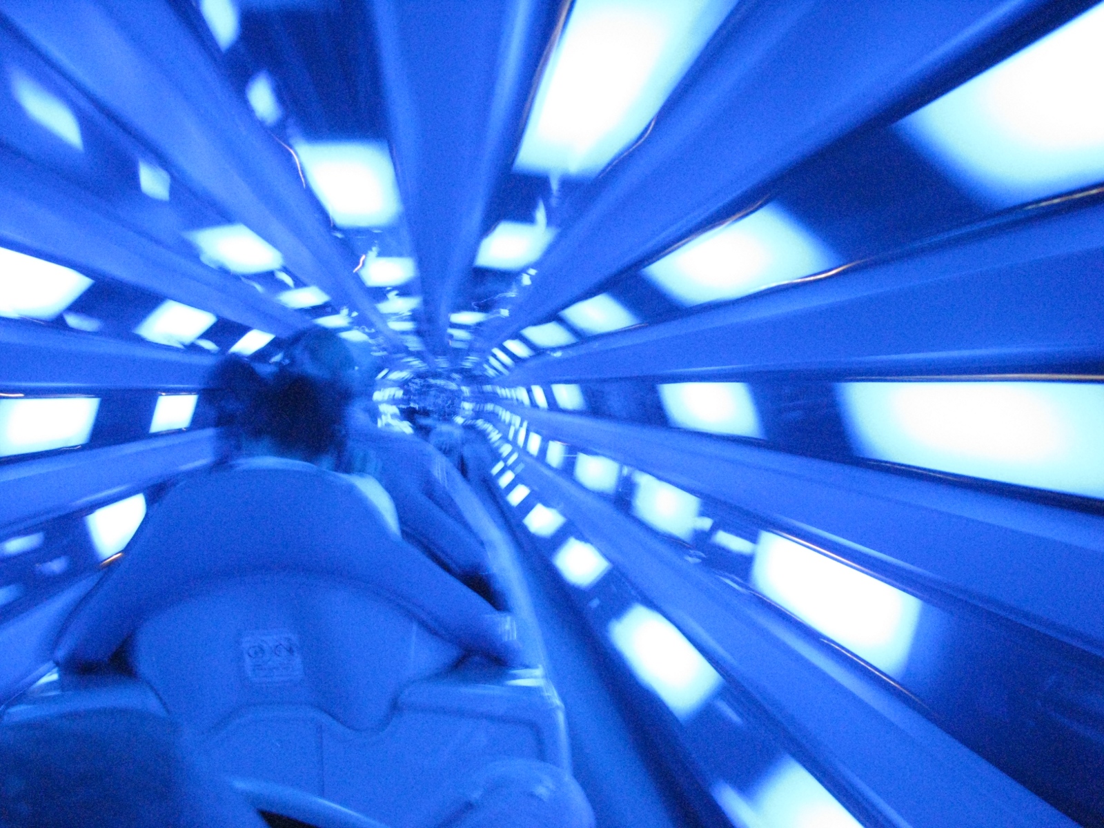
Here's an example of emotion driving design. This was back in the 90's and we were about to add a on-board musical soundtrack to Disneyland's Space Mountain, (an indoor roller coaster through outer space). At that time, rollercoasters were still in their "silent era", accompanied only by blood curdling screams, creaking boards, and the rhythmic clatter of the lift chain. Space Mountain was more cinematic as it was telling a story within galactic environments with some sounds, yet lacked a synchronized on-board soundtrack. Like scoring a movie, we needed to first understand the "emotional roller coaster" that riders were enduring in each scene of the show, then enhance it to greater effect. We rode the ride dozens of times to get the feel (and got paid for it).
The Right Stuff
Then Disney CEO Michael Eisner wanted a recognizable classical score as in the film "2001: A Space Odyssey", but a waltz, given the dynamic speed of the ride, felt inappropriate to the action. Composer Arrin Richard and I finally settled on using a classical melody that was familiar, but with a faster tempo. Although the mood was there, it was not driven by the action and movement of the vehicle. We wanted to accentuate the G-forces guests feel when pressed into the twists, turns, and drops each rocket endures. An electric guitar "lick" or "riff" over the score might give us that effect; (think of Led Zeppelin's "Whole lotta' love"). To that end, we brought in rock pioneer Dick Dale, "King of the surf guitar", who had experienced a renewed popularity due to his music being featured in the film "Pulp Fiction". He lent us his best "licks". We rode Space Mountain after hours at least 30 times, listening and timing each solo of Dale's guitar over the score till they were synced perfectly to the action.
We soon realized that the only emotion we had not fully addressed was the "fear" in our equation. The bigger the dread, the greater the relief when the ride speeds up. This anticipation is mostly felt when each rocket creeps upward on the lift. Roughly half of the time spent on most coasters is spent on those slow sacrificial inclines where we all look down and wonder why we got on the stupid ride in the first place. To heighten all of that, we mimicked a similar moment of anxiety found in those classic 50's Sci-Fi movies; (think saucer door cracking open). The alien strains of a theremin, (a tonal oscillator) created just the right frenzy. That sense of dread climaxes as we dangle at the peak before blasting off into the galaxy. It was a great place to pause in silence before we have "ignition". Filling the silence with a lone bass drum "heartbeat" helped put one last lump in the throat. Increasing the tempo into the climatic final curve was the icing. We were finally there, the music had landed.
Need for Speed
The exit survey results of guests coming off of the attraction were very interesting. Thankfully, over 95% of the guests viewed the score favorably, but the most unexpected result was how many commented that they liked the increased speed, thinking that was the improvement. Of course, the ride system itself remained unchanged. We all believed that subtly enhancing the fear and anxiety, then relieving it with the increased tempo of the score had something to do with it. Treating an experience as a sensory system that you could adjust and hone, helped us to see that enhancing something as incidental as music and pacing could lift the rest of the experience to a much higher level. Knowing what the "wow" wants to be is job one. Next time someone says "Where's the wow?" you'll know the experience needs tuning.
Fear minus death equals fundamentals.